Street murals by graffiti artist Banksy, which have been taken off buildings, have been put on show at an exhibition in London.
Tag / Estelle Lovatt
Buying shares in artworks on show in east London
Owning work by a celebrated artist is out of most peoples’ reach, but a new gallery in east London is giving customers the chance to buy shares in the pieces it has on show.
Via: BBC
Deborah Azzopardi Book Essay
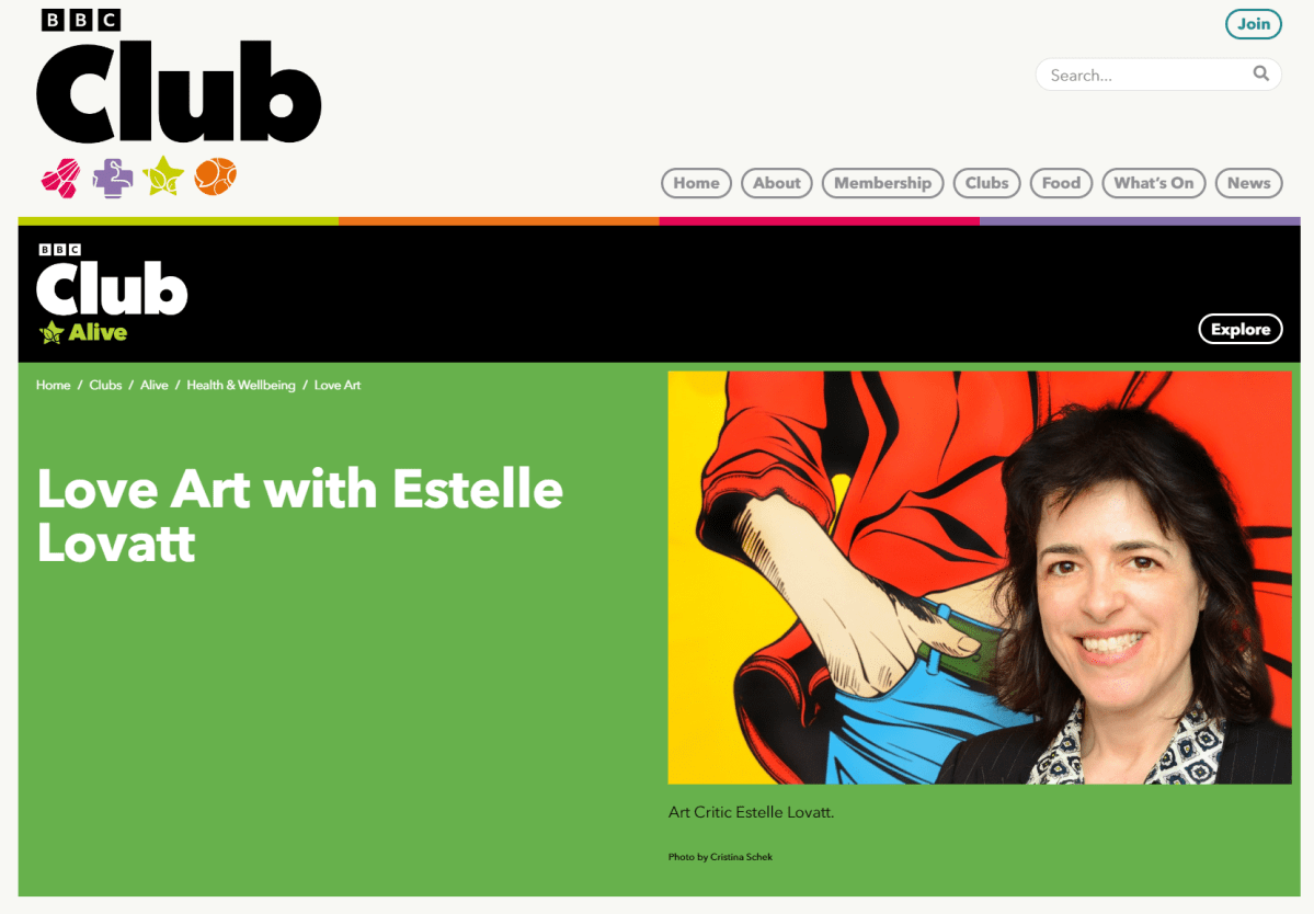
Sometimes you just want to curl up under a blanket. With a good book. A piece of chocolate. A man.
This is what Deborah Azzopardi’s pictures make me feel like doing. They are me. They remind me of the time I had a red convertible sports car. I had two, actually. And yes, they are you, too.
You immediately, automatically, engage with the narrative of Azzopardi’s conversational visual humour. Laughter is the best aphrodisiac, as you know. Never before has the erotic dream been painted by a woman so well. Think of all the furtively duplicitous sexual innuendos (worth seeing) in art history, made for the titillation of the male patron; one of the purposes of art being to arouse emotions, yes. Whilst I see some Japanese Shunga prints coarse next to Azzopardi’s more idealistic visions of contemporary urban life, the fantastical makes Azzopardi playfully sexy. And fun! Her pictures make you feel the same way, as she makes you feel the atmosphere of what goes on behind closed doors.
Azzopardi gives your fantasies a place to live, and grow, aside from the likes of Millais’s Pre-Raphaelite, ‘Isabella’, where Freudian-slips slip up against Victorian prudish angst and erections in the shadows. Azzopardi is more titillating than salacious, more sensual than sexual.
Distinctive, memorable and provocative, Azzopardi’s Pop Art shows what happens to the protagonist as her canvas acts like a storyboard for movies. Azzopardi’s definitely got the ‘When Harry Met Sally….’ – “I’ll have what she’s having” at the Katz’s Delicatessen scene, down to a fine art, in paint.
How does Azzopardi choose her topics? “I don’t choose them,” she says. “Really they choose me. I am inspired by everything I see and hear.” There’s plenty of art historical references from Dali’s frivolous daydreaming joy to Michelangelo’s abandonment of sexual fantasy; with Brancussi’s physical, bodily, dynamics through to Manet’s suggestive ‘Olympia’; Boucher’s thought-provoking, and groin-stimulating, ‘Louise O’Murphy’; Fragonard’s frivolous, knickerless, ‘The Swing’; and Courbet’s glowing ‘The Origin of the World’. But, coming from the male artist, you’d notice art history tends to sexualise art for the male patron because it’s been created by a man. Azzopardi does it her way, not in a vulgar way, through a Graphic-Figurativism that liberates women a step further than Gauguin liberated the girl with Primivitism. Further, Azzopardi is seductive with a non-threatening touch – it is fantasy, in a non-threatening way, like being comfortable with your G.B.F. (Gay Best Friend) discussing your bra size.
Provocative, flirtatious and wonderfully highlighted by playful titles, Azzopardi’s narratives interlink one painting to her next as the story progresses with messages of love and the stories of many. Juxtaposing lines of comic-book text with saucy images within a snap-shot canvas, Azzopardi paints all that you dare to fantasise about.
Unique in approach, you easily recognise an Azzopardi picture. America has Lichtenstein we have Azzopardi. Working simple graphics and toned shading (for depth), the Pop Art line that Azzopardi sketches is different to Lichtenstein’s. Hers is more curvaceous. Feminine. Whereas his lines are male, brash and clunky. And her humour is distinctively British. With the slap-and-tickle, kiss-me-quick, fun of Carry On films and quintessentially English seaside-pier-art where you poke your head through the cut-out cartoon, putting yourself in the picture. “Flash, bang, wallop! What a picture! What a photograph!” (Tommy Steele as Arthur Kipps in the London musical, ‘Half a Sixpence’). We’ve all been there done that, to be a part of visual curvaceous comedy as breasts spill over necklines, buttocks plump under panties and Y-Fronts jockey as floppy sun hats, on the English seaside coast.
Although her large colour surfaces may be simple and basic, she knows how colour works, how to use colour, so she’s not afraid to be simple and basic. It’s natural. Instinctive, like good sex is. Azzopardi’s art makes me think of the poster for ‘The Graduate’ movie when Mrs Robinson (Anne Bancroft) puts on her stockings to seduce Benjamin Braddock (Dustin Hoffman). And just as intimate as Dutch Golden Age paintings, where flirtatious bedroom games are real, Azzopardi references Vermeer in, ‘The Girl with the Diamond Earring’ (made with real diamond dust).
Azzopardi’s simple equations equal simple compositions. Timeless moments of silence that concentrate your concentration. Employing quite a Classical, Medieval, perspective, combined with bold, yet subtle gradations of colour, actually makes Pop-Art-Azzopardi more of a Formal artist. As shadows enable the texture of skin, free-flowing hair, and tender, yielding, flesh, we’d all love to look like an Azzopardi’s woman semi-nude.
Azzopardi’s use of light is an important issue too. The glow, radiance, coming from her portraits highlight the importance of personality. And the importance of experiences as ideas. This has to do with utilising the old-world aesthetics the art world has always, traditionally, celebrated. From the long-established poster-art graphics, as drawn by Toulouse-Lautrec to exude his colourful, flippant, but nevertheless elegant, sensitive and intimate message. Azzopardi, witty and thought provoking, also falls under Magritte’s Surrealist umbrella of suggestive, theatrical, poetic symbolism, as concealed in her stunning 24 carat image, ‘Pure Gold’, where lipstick is seductively applied. And of course it is red lipstick, red lips symbolise being ready for ‘intimate’ contact. When Renoir said, he’d, “painted pictures with my prick”, Azzopardi surely grabbed his baton-paintbrush, becoming the Emily Pankhurst of the art world, shaping women for our time, ensuring they never go back to the kitchen sink again. Unless they’re wearing just an apron, you’d expect.
What is ‘Push Once’ all about? A little bit of James Bond? A little bit of the Apollo 11 first moon landing? A nipple? No it’s a traditional London Routemaster bus bell. Playful, these images are foreplay. Paintings to flirt by. Paintings to fall in love by, and with. Like Manet’s art is art to flirt by, watch out, love is blooming here. Each portrait is a revelation, for ‘She’ is the girl of our day that we meet in the street. She is also Venus encompassing beauty and love. ‘He’ is Casanova, or David Beckham if you’d rather. Remember when Sam Taylor-Wood made her video-portrait of Beckham asleep, everyone – young, old, female and male, queued up to take their selfie ‘sleeping’ with him.
What inspires Deborah? “Laughter. Laughter is the best source of inspiration. Things that make you smile, or even thoughtful …. Museums, books, people; family and friends most importantly. Everything in life that surrounds me. I keep open minded and try to ‘see’ rather than just look.”
‘Close’ and ‘Closer’ are not a pair but are stunning together. This Renaissance referencing diptych makes these paintings of two parts become one as Azzopardi adopts Botticelli’s graceful, linear, rhythm. There is a sense of movement in Azzopardi’s pictures, a sense of Futurist movement. See the man’s handkerchief wiping the broken hearted woman’s tears away in ‘Forever, and ever ….’. Entitled after Aretha Franklin’s hit song, with synaesthesia, you’d hear Ms Franklin singing “I Say A Little Prayer”for you, as, music is the visual metaphor for love, the harmony being between a man and woman. Likewise there are also powerful moments of silence, as characters appear to be caught frozen in time. She uses humour to make her art timeless and enduring. The popularity of her image is similar to that enjoyed by the ‘Chinese Girl’ in the 1950s and 60s, by Vladimir Tretchikoff.
Like a pared-down Patrick Caulfield, with simple black outlines, and, big, flat, single hue, colour, Azzopardi says, “I love the use of colour on a large scale. To me the impact is in the size of the painting with the dynamism of colour.” Much in the same vein as Yves Klein had his blue, Azzporadi has hers. Her colours serve as initial bait to gain your attention, but it is her subject matter that hooks you in, and keeps you captivated, as male torsos are toned and long female legs dangle over the side of a red convertible.
What makes her paint? She just likes to paint. “I have always wanted to paint! I don’t understand why everyone in the world doesn’t paint! It’s probably like an addiction. Although I’m not an addict. Only to chocolate! I think I just paint because I like the subject idea, without any great meaning or explanation.” Says Azzopardi. Even the fashion illustrator from the haute couture world of major designers, René Gruau, makes Azzopardi want to paint. It’s his elegant, economic, use of line.
Like Gruau, Azzopardi draws from real life models too. Beautifully honed, Ralph Lauren model-types, with pert breasts and firm thighs can be seen to be as iconic as Leonardo’s ‘Mona Lisa’, Warhol’s ‘Monroe’ or Goya’s ‘The Naked Maja’. Except, each of Azzopardi’s portraits has three faces. One facing the past of art history; one facing our time – the ‘here-and-now’; and one facing tomorrow – the future.
There is something ‘Wonder Woman’-esque about her colourful pictures that makes you believe the girl is the superhero who triumphs not with punches or kicks, but with love. Images, as bright and bold as I used to be. Indeed can be again, for something about them makes me feel young, like I’m standing by the Fountain of Youth. Youth symbolizes incorruptible purity.
If you think her paintings are lively, you should meet her in person! She’s got a personality that stands out like one of her paintings and a laugh that’s vivacious and colourful. When Jackson Pollock said, “Every good painter paints what he is”, he’d surely be talking about Deborah Azzopardi ….

Essay published in 2014, in Deborah Azzopardi’s debut book.
Images design by Cristina Schek, using artwork by Deborah Azzopardi & quotes by Estelle Lovatt FRSA.
© Estelle Lovatt FRSA
McAlpine Miller: The New Collection
It is so exciting to see McAlpine Miller’s latest artwork.
At first sight I wondered what it was, exactly, that McAlpine Miller’s newest artworks remind me of. Then it hit me. It’s the high-tech look. In them I see something of both the very modern and the nostalgic, in sync.
It is the merger of today’s science of technology with the prowess of ‘live’ cartoon action that is at the heart of his new body of artwork. And it is the clarity of these forms of his, both human and animated, that invite me ‘in’ to his frame, to be a participant. As if a play on the stage, his actors are framed in the scene through architectural elements that challenge today’s 3D space but, realising the art history of centuries past, it is as if you’re looking at a Roman Fresco that’s up to date with 3D Projection Mapping, but also stereographic 4D.
The similarities between his traditionally-painted canvases and today’s Social Media micro-electronics are what integrate his pictures. It’s as if waves of electrical quantum photons (light) take the place of both the traditional Old Master’s Classical or the Modernist’s Impressionistic prism, on level pegging. By taking the cartoons of yesterday and brightening them up with the cartoon colours of today, his sense of hue is as sophisticated as a Renaissance painter’s in softening natural looking skin tints that appear to be blended with today’s CGI pixelated palette. From traditional looking Antique White to Saddle Brown he pulls his visionary-art right bang-up-to-date through colours that are so …. of the ‘now’; of today.
Walk up any High Street, look in the fashion-chain store’s windows and you’ll see all the models dressed in the same lively, exotic, lush Pantone colours that McAlpine Miller squeezes from emerald green to chilli powder pepper red, canary yellow, tangerine tango, hot pink and peach puff. He uses colours that look as though they’re on a video display but they’re not, they’re on his canvas. Here is an artist who really understands what tomorrow’s Social Media is all about. His treatment of pictorial space is brilliant through the combination of multiple spaces and pictorial surfaces ‘released’ (painted) on ‘multiple platforms’ (picture planes) with an apparent Pixar style of animation about them. In eye-catching overlapping of graphics therein lays the McAlpine Miller Modernity.
All the things that David Hockney can do with an iPad in terms of colour, collaged composition and cut-and-paste layering, McAlpine Miller takes full circle by doing New School in an Old School style all, incredibly, with his oil paints! McAlpine Miller is taking Hockney a step further, by taking it a step backwards. Being far more complex, with traditional oil paints. His paintings have a 3D look about them. Seemingly composed through the employment of graphical cropped images edited under a CGI mouse-move, but it is all done with his sable paintbrush not the magic wand of Photoshop. With this, he paints pictures that connect with you, today. McAlpine Miller is one of the best artists of our time, painting about our time, in the best way I’ve seen. This is how he is changing the course of Art History – much in the same way that Da Vinci, Monet and Picasso did. The art of tomorrow starts here ….
Constantly looking around him at our everyday, McAlpine Miller has a set of references that are totally different to other painters. It’s as if, he says, that, “these realities combine to challenge us and perhaps create a greatly unstable world. By uncovering our real issues we discover ourselves. Undressed to the world, yet layered to the world. The illusion continues…”
It appears like he has tagged all this in Pixar animation, transforming, for example, the imagery of Stan Lee, founder of Marvel Comics, and Hanna-Barbera of the 50s and 60s, with Steve Jobs and George Lucas’s Pixar Animation Studios of today. As in, ’Taking the Trash Out’, where Hanna Barbera is alive in Hoagy’s Alley wearing this new summer season’s high wedge sandal. It is not just about taking the trash (rubbish) out, it is about the unwanted material – the waste – as the leftovers of our forgotten civilization, about to be recycled for posterity into today’s computer jargon of the ‘trash’ of the PC world. As he points out, by, “Taking the idea of the central figure and revealing an alternative opinion of that character, [this show hopes] to reveal the ongoing nature of the transparent life. Beauty is only ever skin-deep and our ability to hide behind the facade has become something of a 21st century art form.”
Something else, for (some of) the boys, highly topical and relevant to today, you cannot close your eyes to the psychological interpretation of reference to unconscious homosexual fantasy when Batman can now legally marry Robin. With Catwoman taking the part of the witness, ready to whip you in to shape, in, ‘Woman of the Night’. DC Comics’ Batman – aka Bruce Wayne the billionaire playboy, industrialist and philanthropist that all Americans aspire to become. Whilst for the girls, in, ‘Here to Save the Day’, Superman – the fictional Superhero inspires the a-typical personification of the American, apple-pie-loving girl-next-door Gibson Girl, to show what she is prepared to do for her country, not the other way around. McApline Miller explains, “Highly celebrated and widely identified, beauty hides the ugliness of our reality. War, hatred, anger and religion make up our every day.”
Where, even as goodness Captain America slaps the enemy in the face, you’ll see that it is an extremely sexy, McAlpine Miller high-heeled heroine, in, ‘Salute to the Captain’, from a time when comics cost a slim dime, and models today are just as thin. And in, ‘A Typical Feminine Trait’, he fuses the Terrytoons animation studio with the multiplex Uncle Sam (metaphor for the United States recruiting of soldiers for the Wars), fighting wars, fighting the great ideals of justice, and even, fighting the fusion of today’s fashionable franchise branding where the references to catwalk anorexia and financial waste (and gain), connect.
McAlpine Miller achieves all this through his all-action comic book colour palette painted with his idiosyncratic, painterly, Old Master skill. Together with the industrial precision of a commercial graphic illustrator, over, the prominence of what I’d say is surely his own, Social Media edit look. All blended with Chiaroscurism’s use of shade and light. Unique to McAlpine Miller, there are two kinds of light in his paintings. The light of day, where he makes everything known and available. And the internal, spiritual, light which is when he paints all that which we can only just about imagine in our dreams. I’d be happy to live in a McAlpine Miller picture.
To help you, he splits his multi-focus Cubist compositions in to single-viewpoints of flat, fixed, fragmented planes that sculpt his storyboard characters over overlapping perspectives. Exposing them as collaged Pop Art mass culture, that looks physically disturbed by an Expressionistic revelation of images, through to an Abstract subsistence of layer-upon-layer of veiled-on oil paint revealing, informing and identifying a connection that is pure lifestyle. This is all perfectly clear as McAlpine Miller’s wholesome flesh-and-blood bikini-babes retreat to an ever-eternal return that connects the past to the present, and even the future.
There is also something of the conservative, I’d say spiritual, in his compositions too. From the triptych, ‘Three Times a Lady’, surfaces the early Christian art formatting popular for church altar paintings from the Middle Ages. McAlpine Miller’s canvas is rich in a visual legacy enabling him to project his content-aware prominence, found only in today’s world of celebrity-worship icon advertising. Amidst all of this he uses highly distinctive, iconic, 1950s Americana which he blends with Romanticism. From the portrayal of the beautiful Movie Star from the Golden-olden-good-old-days-gone-by, off-of-the-Silver-Screen, to today’s multicoloured computer-animated, backlit fluorescent light of the iPad, it’s all pure cinema.
He is both painter and public entertainer that, if Jessica Rabbit were alive today, I’m sure that McAlpine Miller would be the artist whom she’d want to be framed by.
©Estelle Lovatt FRSA
Discerning Eye Exhibition | The Mall Galleries
Being a Discerning Eye 2013 selector was a privilege. An honour. Nerve-wracking too!
My individually invited artists are those whose work I liked – much before I even began to understand just how extremely good their art really was. Then I chose my open submission artists.
Deborah Azzopardi
Isabel H Langtry
Ash Naghouni
Jonty Hurwitz
McAlpine Miller
Jane McAdam Freud
Kelvin Okafor
Paul Regan
Paul Coldwell
Charlotte Hodes
I treated curating my art exhibition like a garden. Except my garden is more like a park – a theme-park, with a variety of art so diverse, that excellent artists of all ages, and technical abilities, working in all mediums, and styles, come together. All my artists are making artworks that I like looking at. They cheer me up. And they exhilarate me.
My plot reaps of a visual harvest with different tastes and styles ensuring surprises. I love what they do.
There is the mutual ‘getting-to-know-each other’ period that occurs when you first spot the artwork you’ll fall in love with. It’s a bit like a first date; the bioengineering of it all is ever-so-personal. Though do remember, that even though glazed in love, a picture of a beautiful girl that is badly painted is not as pictorially stunning as a picture of an ugly girl that is beautifully painted. All in all, I’ve artworks so alive, I’m sure they breathe.
Like your favourite soft armchair, or carbohydrates for the eyes, this is how best to experience art. Enjoy…
Photography by Cristina Schek.

Global flight-path maps: Five interpretations
Michael Markieta’s images depicting flight paths across the planet attracted huge interest from our readers. What do the maps reveal? We asked five experts to give their interpretation.
The art critic
Estelle Lovatt, estellelovatt.com
Wow, it’s beautiful. It is not only dealing with two-dimensionality, it’s trying to create three dimensions, or four dimensions – giving you a notion that you are travelling across the surface of this image.
It’s almost like contemporary fractalisation – based on fractals, those beautiful divisions of science and nature. A number of artists have exploited them. Max Ernst based a lot of his surreal landscapes on fractalisation.
I would definitely exhibit these images. They give a great sense of movement and space. I think if Mark Rothko were alive today, he would be extremely inspired by this. Rothko’s half-grey and half-black paintings are sometimes thought of as purely abstract, but he was painting them at the time of the Moon landings.
One of the things artists have to do today is to keep up with contemporary visual imagery. They have to embrace modern technology, and an artwork does not just have to be oil on linen in a gilt, beautiful fixed frame. It has to be “of the time” – these are of the time and beautiful abstract shapes, very sensitively done.
The environmentalist
Bill Hemmings, aviation and shipping programme manager at Transportenvironment.org
When you see the three brightest patches – Europe, North America, and East Asia – you are seeing the three main focuses of aviation emissions. I am surprised that the Transatlantic flights do not show up as brighter because emissions are intense there as well.
The images re-affirm what we already know. Between 1974 and 2009, cumulatively, Europe was responsible for 38% of aviation traffic, Asia/Pacific was responsible for 29%, and North America for 20%.
In climate change talks, there is a lot of discussion about historical responsibility – the countries where the industrial revolution took place centuries ago bear the greatest responsibility. But in aviation it’s different. Long-haul flights, the source of most emissions, began in the 1970s, and we see that Asia is not that far behind. Not just China, but Thailand, Malaysia, Japan, Korea, and Australasia all carry a heavy responsibility.
You can see the three main areas of the world producing aviation emissions. They should take the lead in reducing them.
The aviation consultant
Europe’s hubs are bunched together – and send many flights to the Canary Islands
Europe looks so bright because it has so many short-haul flights. It’s also one of the busiest global markets and there are several hubs in relatively close proximity in Europe: Paris, Frankfurt, Amsterdam and London.
You can very clearly make out American hubs like Atlanta, Dallas, Houston and Denver – there’s a saying in the US that whether you go to heaven or hell, you have to go via Atlanta.
The map doesn’t quite reflect that the actual routes change from day to day, depending on variables like wind direction, air traffic control charges and fuel costs.
But you can see where things are changing. Asia is really dense with flight paths. In China you have a rising middle class travelling for business and leisure.
What we’re going to see in a few years is more connections between Asia and Africa, and South America and Africa, along with more “south-south” trade.
The data visualisation expert
Damien McCloud, geographic information systems, Arup
Visualisations like this are great. This is very clean and very simple and it gives an instant narrative. But my concern is that there’s a tendency to over-interpret these kinds of pictures. This is a snapshot.
You can see the density of the flights, but it doesn’t show you how many people are travelling on them. You could do that by colouring them differently.
Speaking as someone who got caught up in Hurricane Sandy last year, it would be good if you could overlay the map and show which flights are vulnerable to environmental risks.
The first thing you see is that there are three global hubs – the US, Europe and South-east Asia. If you were to overlay the major cities of the world it would show you most of them.
If you were coming from another planet and you were looking at this, you might think there weren’t many people living in Africa or Latin America.
The philosopher
Mark Vernon
It looks like a strange life-form, like seeing translucent plankton in the sea, lighting up in certain parts… and you wonder what’s going on in the darker parts, what kind of life, or activity, is concealed.
We are not seeing the life of individual human beings, but the life of the species as a whole, as if the species was one organism, pulsating like a jellyfish. Maybe it represents our collective existence?
Because of the darkness, it’s like a side of ourselves that no individual can control or understand. It feels like a dream – the collective unconscious perhaps.
In the images where the lights are denser, there is something a bit entangled and manic. It’s not completely peaceful. It’s beautiful, but when you start to look, it’s mad – a mad spider’s web, slightly psychotic.
Via: BBC