

Street murals by graffiti artist Banksy, which have been taken off buildings, have been put on show at an exhibition in London.
Street murals by graffiti artist Banksy, which have been taken off buildings, have been put on show at an exhibition in London.

Finland is to produce the “world’s first” homoerotic stamps, celebrating one of the country’s most famous artists – Tom of Finland.
Via: BBC News

Consider the idea of spending $142m (£89m, 106m euros) on a work of art and then being told you have bagged a bargain.
A number of art critics have said that the price paid for Three Studies of Lucian Freud (1969), by Francis Bacon, is money well spent.
While the anonymous new owner decides how to insure and where to hang the triptych, stretched householders may wonder how a purchase like this could ever be a good deal.
And should they decide to invest in art themselves – at a less spectacular level – then there are warnings that the value of such items can go down as well as up.
The Bacon masterpiece became the most expensive artwork ever sold at auction when it went under the hammer after six minutes of frantic bidding.
Calculations by The Economist suggest that Van Gogh’s 1890 work Portrait du Docteur Gachet actually cost more at auction if inflation is taken into account. The $82.5m paid for that painting in 1990 is the equivalent of $148.6m at today’s prices, the magazine says.
Some people say it is vulgar to talk about art and money at the same time. Estelle Lovatt , Art critic
Meanwhile, in 2011, the Qatari royal family paid more than $250m for a Cezanne in a private sale, The Economist adds.
All the same, $142m is an eye-watering amount of money, even though there are three paintings in the set, and especially as we are only slowly emerging from a global financial crisis.

A total of £782m was spent during the Christie’s auction of post-war and contemporary art that night.
On the same day as the Bacon sale, a diamond known as the Pink Star sold for $83m (£52m, 62m euros) at auction in Geneva – the highest auction price for a gemstone.
“At the moment people wonder how come art is securing such funds,” says art critic Estelle Lovatt.
“When you consider interest rates at the banks at the moment, your money works much better and the result looks much prettier on the wall or on a plinth.
“It has been an incredible year [for art sales], especially given the financial situation.
“Some people say it is vulgar to talk about art and money at the same time – cash is the C-word in the art world. But it is a great investment.”
Or is it?
Just a few hours after record-breaking sums were being bid in New York and Geneva, a watercolour work called Portrait of a Lady was sold for £238 at an auction in Edinburgh.
Another watercolour entitled Flower Arrangement went under the hammer for £275, and the top sale of the day was a mahogany bookcase that fetched £18,750.
Auctions such as this are taking place across the country most days of the week, buoyed in part by the popularity of daytime TV auction shows such as Antiques Roadshow and internet auction sites.

Yet, it is a two-pace market, according to Richard Madley, a fellow of the National Association of Valuers and Auctioneers (NAVA).
“It is akin to the London housing market compared to the rest of the UK, where prices go up and up in the capital,” he says.
“A work by Bacon is like an eight-bedroom house in Belgravia, while the chest of drawers is the two-bedroom cottage in the North East which remains affordable,” he says.
While the global super-rich keep spending record-breaking amounts at the top end of the market, prices of domestic, lower-value antiques have tumbled, he says.
For example, last year, $119.9m (£74m) was paid for Edvard Munch’s The Scream, whereas in the last 10 years the typical price of a traditional dinner service or a Victorian wardrobe has halved.
The reason is that masterpieces will usually retain their appeal, while lower level furniture and art are at the mercy of fashion.
“Antiques are not cool. Young people in their 30s and 40s do not want what their parents hung on the wall; they do not want a big Victorian extending dining table; they want glass and chrome,” Mr Madley says.
Anyone considering taking the risk of investing could look for a lesson in the market for works from China and Japan, according to auctioneer Mr Madley.
Bidding for Japanese porcelain hit its height in the 1990s but prices have fallen since.
Yet, as disposable income rises in China, the new middle class and wealthy are buying back the heritage that left the country in decades past. Chinese ceramics, bronzes, jade and metalwork are proving particularly popular.
In one case, Mr Madley says, a Chinese pottery bowl that had a reserve price of £200 sold for £37,000. A lot such as this is known as a sleeper, which is awoken by frantic bidding.
Anyone thinking of buying at auction for the first time should ask for help before the bidding starts, Mr Madley suggests, and they do not need to worry that scratching their nose could be mistaken as a bid and cost them thousands of pounds.
“Auctioneers look for serious bidding signals, and bidders now are often given a piece of paper with their number on when they register,” he says.
Auction tips:
The most important advice when buying art, according to Mr Madley, was a tip he was given as a young man by one of his bosses.
“Buy art with your eyes and not your ears. It must give you pleasure to look at it, don’t buy it because someone tells you it will be worth more in a few years’ time,” he says.
Still, ask anyone who was at the auction of the Bacon triptych last week, and they will say that as the bidding hit stratospheric levels, they could believe neither their eyes nor their ears.

Being a Discerning Eye 2013 selector was a privilege. An honour. Nerve-wracking too!
My individually invited artists are those whose work I liked – much before I even began to understand just how extremely good their art really was. Then I chose my open submission artists.
Deborah Azzopardi
Isabel H Langtry
Ash Naghouni
Jonty Hurwitz
McAlpine Miller
Jane McAdam Freud
Kelvin Okafor
Paul Regan
Paul Coldwell
Charlotte Hodes
I treated curating my art exhibition like a garden. Except my garden is more like a park – a theme-park, with a variety of art so diverse, that excellent artists of all ages, and technical abilities, working in all mediums, and styles, come together. All my artists are making artworks that I like looking at. They cheer me up. And they exhilarate me.
My plot reaps of a visual harvest with different tastes and styles ensuring surprises. I love what they do.
There is the mutual ‘getting-to-know-each other’ period that occurs when you first spot the artwork you’ll fall in love with. It’s a bit like a first date; the bioengineering of it all is ever-so-personal. Though do remember, that even though glazed in love, a picture of a beautiful girl that is badly painted is not as pictorially stunning as a picture of an ugly girl that is beautifully painted. All in all, I’ve artworks so alive, I’m sure they breathe.
Like your favourite soft armchair, or carbohydrates for the eyes, this is how best to experience art. Enjoy…
Photography by Cristina Schek.
")
")
")
")
")
")
")
")
")
")
")
")
")
")
")
")
")
")
")
")
")
")
")
")
")
")
")
")
")
")
")
")
")
")
")
")
")
")
")
")
")
")
")
")
")
")
")
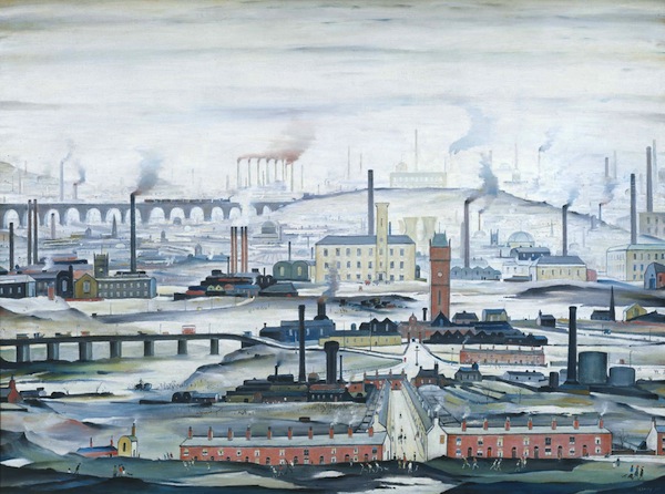
Industrial Landscape 1955 Tate © The Estate of L.S. Lowry
If you are an American coming over to London for your summer vacation this year, then I must recommend one exhibition to you: Lowry and the Painting of Modern Life at Tate Britain.
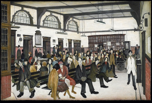
I was having a discussion recently about the painter L.S. Lowry and his impact on the art world. The discussion revolved around how Lowry is often a victim of the art world’s middle-class snobbery when assessed as a painter.
Be it panoramic or intimate vignettes of the North of England, Lowry’s matchstick men may look fairly idiotic; nonetheless they are instantly recognizable. Hard-edged, grotesque and comedic, Lowry’s painted people might look formulaic because they were drawn from his memory. Although simple-looking, you’ll recognize human variety in every one of his people. In fact, many faces in his paintings are former tenants. In his lifetime, Lowry made over 1,000 paintings and 8,000 drawings. If you asked him, “What are you doing when you’re not painting?” he might have replied, “thinking about painting.” Lowry often described himself as “a simple man,” but, in fact, he was a complex and contradictory character considering the murky realism of his environment and British history in general.
Ancoats Hospital Outpatients’ Hall 1952, Whitworth Art Gallery, University of Manchester
It took the attention of American art critic Jessica Stephens to wake the world up to Lowry’s work. In her writing in ‘The Studio’ in 1928, she describes how “beauty may be of many kinds…The work of Mr. L.S. Lowry has qualities which make it difficult to forget.”
For those not familiar with Lowry’s artwork, he was a modest man in both character and artistic temperament, known for his landscapes which spoke to the enormity of England’s industrialization. His pictures tell the story of life before the National Health Service (similar to Obamacare): pre small-scale Capitalism; pre strike meetings. In other words, British history in oil paint. Or, as Jessica Stephens wrote: “It is the nearest rendering of the life of Lancashire one knows.”
There are lots of assumptions surrounding Laurence Stephen Lowry (1887 – 1976). Here’s the truth for you; he was born to lower middle class parents (a real estate agent and hopeful concert pianist) in Stretford, Manchester, Northern England. A move to the industrial hamlet of Pendlebury led to an obsessive subject matter for the young painter. He captured the twisted forms the human body took when it was bent over machines for 12 hours a day, six days a week. Always scurrying along, the subjects of his paintings have very little time and money; too busy running around representing the rituals of public life from football matches (otherwise known as soccer to Americans) to protest marches, evictions and fist-fights. The experiences of the 20th-century working-class life in England were all captured by Lowry.

Coming Out of School / Courtesy Tate © The Estate of L.S. Lowry
A rent collector by day and virgin by night, Lowry lived with his mother and was formally trained in drawing and painting under the French Impressionist painter Valette. The Parisian galleries and French art critics recognized and helped further his endeavors in the history of British art. He exhibited at the Lefevre gallery in Mayfair, London, and was a visiting tutor at the prestigious Slade School of Fine Art, recognised at the time as one of the best art schools in England.
What was unusual about Lowry was that he was not the typical moneyed student graduating from the Courtauld Institute of Art, nor was he an artist that fit into the traditional Eton-Oxford English mold. Nor did he study art history at St Andrews University in Scotland – where Kate Middleton and Prince William, now the Duke and Duchess of Cambridge, first met and studied art history. Why? Simply because Lowry’s subject as a painter was British industry – not the British Empire.
Although Lowry has never been a darling of the art world, his work does find its fans. The minute details in his densely-packed paintings give the eye much to feed on. More importantly, his landscapes of Northern England’s textile mills and factory chimneys make Lowry an artist of ‘place’. This ‘localism’ – topographies of slums in Manchester – speaks to those who inhabit these areas. Whereas traditionally labor is concealed within factory walls, Lowry brings it to the public’s attention: showing men at work or on the streets. Describing the slum subjects in his paintings, Lowry said: “I saw the industrial scene and I was affected by it. I tried to paint it all the time. I tried to paint the industrial scene as best I could. It wasn’t easy.” His ambition was to reveal the industrial scenes shaping England at the time. No one else had done it seriously and Lowry had an edge over the rest: he was wise about street life.

The Fever Van 1935 © The Estate of LS Lowry / Image courtesy of National Museums Liverpool
First melodramatic and pessimistic, his mood changes drastically after World War II. If you’re surprised at how small the paintings are, just wait for the last room in this exhibition, which houses the Industrial Landscapes. Here, for the first time ever, are five grand-scale panoramic paintings of Lowry’s world shown together. His world is a pictorial record of a time before Prime Minister Margaret Thatcher changed the face of British industry. However, when the industrial scene changed, so did the nature of Lowry’s subject matter. He couldn’t paint what wasn’t there. So Lowry left for the mining districts of South Wales, where he painted the trees looking like they oozed smoke. Faced with these panoramas the size of large-scale history paintings, the viewer finally understands the scale and scope of Lowry’s ambition.
Lowry certainly left more than a cultural legacy. What makes this the perfect exhibition at the moment, is our social awareness of our unemployment and current dismal financial times. Lest we forget, today, Lowry’s artwork often sells for millions of dollars. Enjoy.
Lowry and the Painting of Modern Life runs from 25 June – 20 October 2013 at Tate Britain.
By
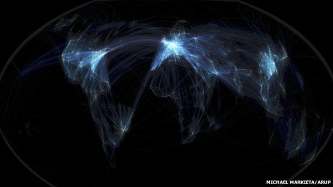
Michael Markieta’s images depicting flight paths across the planet attracted huge interest from our readers. What do the maps reveal? We asked five experts to give their interpretation.
Estelle Lovatt, estellelovatt.com
Wow, it’s beautiful. It is not only dealing with two-dimensionality, it’s trying to create three dimensions, or four dimensions – giving you a notion that you are travelling across the surface of this image.
It’s almost like contemporary fractalisation – based on fractals, those beautiful divisions of science and nature. A number of artists have exploited them. Max Ernst based a lot of his surreal landscapes on fractalisation.
I would definitely exhibit these images. They give a great sense of movement and space. I think if Mark Rothko were alive today, he would be extremely inspired by this. Rothko’s half-grey and half-black paintings are sometimes thought of as purely abstract, but he was painting them at the time of the Moon landings.
One of the things artists have to do today is to keep up with contemporary visual imagery. They have to embrace modern technology, and an artwork does not just have to be oil on linen in a gilt, beautiful fixed frame. It has to be “of the time” – these are of the time and beautiful abstract shapes, very sensitively done.
Bill Hemmings, aviation and shipping programme manager at Transportenvironment.org
When you see the three brightest patches – Europe, North America, and East Asia – you are seeing the three main focuses of aviation emissions. I am surprised that the Transatlantic flights do not show up as brighter because emissions are intense there as well.
The images re-affirm what we already know. Between 1974 and 2009, cumulatively, Europe was responsible for 38% of aviation traffic, Asia/Pacific was responsible for 29%, and North America for 20%.
In climate change talks, there is a lot of discussion about historical responsibility – the countries where the industrial revolution took place centuries ago bear the greatest responsibility. But in aviation it’s different. Long-haul flights, the source of most emissions, began in the 1970s, and we see that Asia is not that far behind. Not just China, but Thailand, Malaysia, Japan, Korea, and Australasia all carry a heavy responsibility.
You can see the three main areas of the world producing aviation emissions. They should take the lead in reducing them.
Europe’s hubs are bunched together – and send many flights to the Canary Islands
Europe looks so bright because it has so many short-haul flights. It’s also one of the busiest global markets and there are several hubs in relatively close proximity in Europe: Paris, Frankfurt, Amsterdam and London.
You can very clearly make out American hubs like Atlanta, Dallas, Houston and Denver – there’s a saying in the US that whether you go to heaven or hell, you have to go via Atlanta.
The map doesn’t quite reflect that the actual routes change from day to day, depending on variables like wind direction, air traffic control charges and fuel costs.
But you can see where things are changing. Asia is really dense with flight paths. In China you have a rising middle class travelling for business and leisure.
What we’re going to see in a few years is more connections between Asia and Africa, and South America and Africa, along with more “south-south” trade.
Damien McCloud, geographic information systems, Arup
Visualisations like this are great. This is very clean and very simple and it gives an instant narrative. But my concern is that there’s a tendency to over-interpret these kinds of pictures. This is a snapshot.
You can see the density of the flights, but it doesn’t show you how many people are travelling on them. You could do that by colouring them differently.
Speaking as someone who got caught up in Hurricane Sandy last year, it would be good if you could overlay the map and show which flights are vulnerable to environmental risks.
The first thing you see is that there are three global hubs – the US, Europe and South-east Asia. If you were to overlay the major cities of the world it would show you most of them.
If you were coming from another planet and you were looking at this, you might think there weren’t many people living in Africa or Latin America.
Mark Vernon
It looks like a strange life-form, like seeing translucent plankton in the sea, lighting up in certain parts… and you wonder what’s going on in the darker parts, what kind of life, or activity, is concealed.
We are not seeing the life of individual human beings, but the life of the species as a whole, as if the species was one organism, pulsating like a jellyfish. Maybe it represents our collective existence?
Because of the darkness, it’s like a side of ourselves that no individual can control or understand. It feels like a dream – the collective unconscious perhaps.
In the images where the lights are denser, there is something a bit entangled and manic. It’s not completely peaceful. It’s beautiful, but when you start to look, it’s mad – a mad spider’s web, slightly psychotic.
Via: BBC
