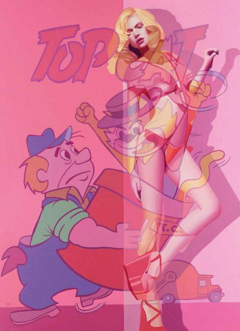
McAlpine Miller: The New Collection

smc-taking-out-the-trash

It is so exciting to see McAlpine Miller’s latest artwork.

At first sight I wondered what it was, exactly, that McAlpine Miller’s newest artworks remind me of. Then it hit me. It’s the high-tech look. In them I see something of both the very modern and the nostalgic, in sync.

It is the merger of today’s science of technology with the prowess of ‘live’ cartoon action that is at the heart of his new body of artwork. And it is the clarity of these forms of his, both human and animated, that invite me ‘in’ to his frame, to be a participant. As if a play on the stage, his actors are framed in the scene through architectural elements that challenge today’s 3D space but, realising the art history of centuries past, it is as if you’re looking at a Roman Fresco that’s up to date with 3D Projection Mapping, but also stereographic 4D.

The similarities between his traditionally-painted canvases and today’s Social Media micro-electronics are what integrate his pictures. It’s as if waves of electrical quantum photons (light) take the place of both the traditional Old Master’s Classical or the Modernist’s Impressionistic prism, on level pegging. By taking the cartoons of yesterday and brightening them up with the cartoon colours of today, his sense of hue is as sophisticated as a Renaissance painter’s in softening natural looking skin tints that appear to be blended with today’s CGI pixelated palette. From traditional looking Antique White to Saddle Brown he pulls his visionary-art right bang-up-to-date through colours that are so …. of the ‘now’; of today.

Walk up any High Street, look in the fashion-chain store’s windows and you’ll see all the models dressed in the same lively, exotic, lush Pantone colours that McAlpine Miller squeezes from emerald green to chilli powder pepper red, canary yellow, tangerine tango, hot pink and peach puff. He uses colours that look as though they’re on a video display but they’re not, they’re on his canvas. Here is an artist who really understands what tomorrow’s Social Media is all about. His treatment of pictorial space is brilliant through the combination of multiple spaces and pictorial surfaces ‘released’ (painted) on ‘multiple platforms’ (picture planes) with an apparent Pixar style of animation about them. In eye-catching overlapping of graphics therein lays the McAlpine Miller Modernity.

All the things that David Hockney can do with an iPad in terms of colour, collaged composition and cut-and-paste layering, McAlpine Miller takes full circle by doing New School in an Old School style all, incredibly, with his oil paints! McAlpine Miller is taking Hockney a step further, by taking it a step backwards. Being far more complex, with traditional oil paints. His paintings have a 3D look about them. Seemingly composed through the employment of graphical cropped images edited under a CGI mouse-move, but it is all done with his sable paintbrush not the magic wand of Photoshop. With this, he paints pictures that connect with you, today. McAlpine Miller is one of the best artists of our time, painting about our time, in the best way I’ve seen. This is how he is changing the course of Art History – much in the same way that Da Vinci, Monet and Picasso did. The art of tomorrow starts here ….

Constantly looking around him at our everyday, McAlpine Miller has a set of references that are totally different to other painters. It’s as if, he says, that, “these realities combine to challenge us and perhaps create a greatly unstable world. By uncovering our real issues we discover ourselves. Undressed to the world, yet layered to the world. The illusion continues…”

It appears like he has tagged all this in Pixar animation, transforming, for example, the imagery of Stan Lee, founder of Marvel Comics, and Hanna-Barbera of the 50s and 60s, with Steve Jobs and George Lucas’s Pixar Animation Studios of today. As in, ’Taking the Trash Out’, where Hanna Barbera is alive in Hoagy’s Alley wearing this new summer season’s high wedge sandal. It is not just about taking the trash (rubbish) out, it is about the unwanted material – the waste – as the leftovers of our forgotten civilization, about to be recycled for posterity into today’s computer jargon of the ‘trash’ of the PC world. As he points out, by, “Taking the idea of the central figure and revealing an alternative opinion of that character, [this show hopes] to reveal the ongoing nature of the transparent life. Beauty is only ever skin-deep and our ability to hide behind the facade has become something of a 21st century art form.”

Something else, for (some of) the boys, highly topical and relevant to today, you cannot close your eyes to the psychological interpretation of reference to unconscious homosexual fantasy when Batman can now legally marry Robin. With Catwoman taking the part of the witness, ready to whip you in to shape, in, ‘Woman of the Night’. DC Comics’ Batman – aka Bruce Wayne the billionaire playboy, industrialist and philanthropist that all Americans aspire to become. Whilst for the girls, in, ‘Here to Save the Day’, Superman – the fictional Superhero inspires the a-typical personification of the American, apple-pie-loving girl-next-door Gibson Girl, to show what she is prepared to do for her country, not the other way around. McApline Miller explains, “Highly celebrated and widely identified, beauty hides the ugliness of our reality. War, hatred, anger and religion make up our every day.”

Where, even as goodness Captain America slaps the enemy in the face, you’ll see that it is an extremely sexy, McAlpine Miller high-heeled heroine, in, ‘Salute to the Captain’, from a time when comics cost a slim dime, and models today are just as thin. And in, ‘A Typical Feminine Trait’, he fuses the Terrytoons animation studio with the multiplex Uncle Sam (metaphor for the United States recruiting of soldiers for the Wars), fighting wars, fighting the great ideals of justice, and even, fighting the fusion of today’s fashionable franchise branding where the references to catwalk anorexia and financial waste (and gain), connect.

McAlpine Miller achieves all this through his all-action comic book colour palette painted with his idiosyncratic, painterly, Old Master skill. Together with the industrial precision of a commercial graphic illustrator, over, the prominence of what I’d say is surely his own, Social Media edit look. All blended with Chiaroscurism’s use of shade and light. Unique to McAlpine Miller, there are two kinds of light in his paintings. The light of day, where he makes everything known and available. And the internal, spiritual, light which is when he paints all that which we can only just about imagine in our dreams. I’d be happy to live in a McAlpine Miller picture.

To help you, he splits his multi-focus Cubist compositions in to single-viewpoints of flat, fixed, fragmented planes that sculpt his storyboard characters over overlapping perspectives. Exposing them as collaged Pop Art mass culture, that looks physically disturbed by an Expressionistic revelation of images, through to an Abstract subsistence of layer-upon-layer of veiled-on oil paint revealing, informing and identifying a connection that is pure lifestyle. This is all perfectly clear as McAlpine Miller’s wholesome flesh-and-blood bikini-babes retreat to an ever-eternal return that connects the past to the present, and even the future.

There is also something of the conservative, I’d say spiritual, in his compositions too. From the triptych, ‘Three Times a Lady’, surfaces the early Christian art formatting popular for church altar paintings from the Middle Ages. McAlpine Miller’s canvas is rich in a visual legacy enabling him to project his content-aware prominence, found only in today’s world of celebrity-worship icon advertising. Amidst all of this he uses highly distinctive, iconic, 1950s Americana which he blends with Romanticism. From the portrayal of the beautiful Movie Star from the Golden-olden-good-old-days-gone-by, off-of-the-Silver-Screen, to today’s multicoloured computer-animated, backlit fluorescent light of the iPad, it’s all pure cinema.

He is both painter and public entertainer that, if Jessica Rabbit were alive today, I’m sure that McAlpine Miller would be the artist whom she’d want to be framed by.

©Estelle Lovatt FRSA

Can spending millions on art ever be a good investment?

_70396846_bacon-triptych


Consider the idea of spending $142m (£89m, 106m euros) on a work of art and then being told you have bagged a bargain.

A number of art critics have said that the price paid for Three Studies of Lucian Freud (1969), by Francis Bacon, is money well spent.

While the anonymous new owner decides how to insure and where to hang the triptych, stretched householders may wonder how a purchase like this could ever be a good deal.

And should they decide to invest in art themselves – at a less spectacular level – then there are warnings that the value of such items can go down as well as up.

Crisis? What crisis?

The Bacon masterpiece became the most expensive artwork ever sold at auction when it went under the hammer after six minutes of frantic bidding.

Calculations by The Economist suggest that Van Gogh’s 1890 work Portrait du Docteur Gachet actually cost more at auction if inflation is taken into account. The $82.5m paid for that painting in 1990 is the equivalent of $148.6m at today’s prices, the magazine says.

Some people say it is vulgar to talk about art and money at the same time. Estelle Lovatt , Art critic

Meanwhile, in 2011, the Qatari royal family paid more than $250m for a Cezanne in a private sale, The Economist adds.

All the same, $142m is an eye-watering amount of money, even though there are three paintings in the set, and especially as we are only slowly emerging from a global financial crisis.

Pink Star
The Pink Star was sold for $83m at auction in Geneva

A total of £782m was spent during the Christie’s auction of post-war and contemporary art that night.

On the same day as the Bacon sale, a diamond known as the Pink Star sold for $83m (£52m, 62m euros) at auction in Geneva – the highest auction price for a gemstone.

“At the moment people wonder how come art is securing such funds,” says art critic Estelle Lovatt.

“When you consider interest rates at the banks at the moment, your money works much better and the result looks much prettier on the wall or on a plinth.

“It has been an incredible year [for art sales], especially given the financial situation.

“Some people say it is vulgar to talk about art and money at the same time – cash is the C-word in the art world. But it is a great investment.”

Or is it?

Top v bottom

Just a few hours after record-breaking sums were being bid in New York and Geneva, a watercolour work called Portrait of a Lady was sold for £238 at an auction in Edinburgh.

Another watercolour entitled Flower Arrangement went under the hammer for £275, and the top sale of the day was a mahogany bookcase that fetched £18,750.

Auctions such as this are taking place across the country most days of the week, buoyed in part by the popularity of daytime TV auction shows such as Antiques Roadshow and internet auction sites.

The Scream by Edvard Munch
The Scream by Edvard Munch could have been yours for £74m

Yet, it is a two-pace market, according to Richard Madley, a fellow of the National Association of Valuers and Auctioneers (NAVA).

“It is akin to the London housing market compared to the rest of the UK, where prices go up and up in the capital,” he says.

“A work by Bacon is like an eight-bedroom house in Belgravia, while the chest of drawers is the two-bedroom cottage in the North East which remains affordable,” he says.

While the global super-rich keep spending record-breaking amounts at the top end of the market, prices of domestic, lower-value antiques have tumbled, he says.

For example, last year, $119.9m (£74m) was paid for Edvard Munch’s The Scream, whereas in the last 10 years the typical price of a traditional dinner service or a Victorian wardrobe has halved.

The reason is that masterpieces will usually retain their appeal, while lower level furniture and art are at the mercy of fashion.

“Antiques are not cool. Young people in their 30s and 40s do not want what their parents hung on the wall; they do not want a big Victorian extending dining table; they want glass and chrome,” Mr Madley says.

Chinese lesson

Anyone considering taking the risk of investing could look for a lesson in the market for works from China and Japan, according to auctioneer Mr Madley.

Bidding for Japanese porcelain hit its height in the 1990s but prices have fallen since.

Yet, as disposable income rises in China, the new middle class and wealthy are buying back the heritage that left the country in decades past. Chinese ceramics, bronzes, jade and metalwork are proving particularly popular.

In one case, Mr Madley says, a Chinese pottery bowl that had a reserve price of £200 sold for £37,000. A lot such as this is known as a sleeper, which is awoken by frantic bidding.

Anyone thinking of buying at auction for the first time should ask for help before the bidding starts, Mr Madley suggests, and they do not need to worry that scratching their nose could be mistaken as a bid and cost them thousands of pounds.

“Auctioneers look for serious bidding signals, and bidders now are often given a piece of paper with their number on when they register,” he says.

Auction tips:

  • Visit an auction to watch before taking part
  • Look at the guide prices in the catalogue
  • Go to a preview to see what is being sold
  • Do not forget the extra cost of the buyer’s premium – the auctioneer’s fee
  • Have a look around on preview days, talk to the auctioneer, and pick up a catalogue
  • Look at the guide price. The minimum amount that the seller will accept is confidential, but cannot exceed the lower estimate
  • Watch an auction first, before taking part
  • Remember the extra charge, known as a buyer’s premium. It can vary from 5% to 25% of the bid price. Ask about the cost beforehand

The most important advice when buying art, according to Mr Madley, was a tip he was given as a young man by one of his bosses.

“Buy art with your eyes and not your ears. It must give you pleasure to look at it, don’t buy it because someone tells you it will be worth more in a few years’ time,” he says.

Still, ask anyone who was at the auction of the Bacon triptych last week, and they will say that as the bidding hit stratospheric levels, they could believe neither their eyes nor their ears.

‘Go Figurative’ : Going Back To Figurative Art via Barack Obama

Since the 1990s, the phrase Conceptual Art has been unfairly manipulated to become an all-encompassing term, generating derision, which some erroneously apply to the Turner Prize, and other anti-figurative art.

As change comes politically, so it follows artistically with art imitating politics, reflecting its time.  And so it was, that under former-President George W. Bush art moved towards temporary sculpture, with artists remembering 9/11 as a ‘sculptural’ event based around two Giacometti-tall Judd-shiny minimal ‘sculptures’, razed to the ground.  Demolished as a Happening art-from.  Now with President Obama in charge, figurative artist Shepard Fairey was selected to paint Barack’s official Presidential portrait.  Deem it au courant for artists to investigate the ‘self’, promoting the figurative back into art, back into vogue.

Putting the ‘F’ word, figurative, into ‘Neo-Figurativism’, Go Figurative – a new web site gallery championed by co-founders and Directors Sally Perry and Janine Collins – respects the value and importance of reality-based fine art.  With creative ability, aesthetic value and sound artistic judgement, Go Figuratives’s Figurescapists depict life, retaining strong references to the real world and the human figure understanding what Picasso projected, when he said, “There is no abstract art.  You must always start with something figurative.”

As our visual appetite demands something that is visually easier to understand, Go Figurative believes traditional artist’s skills, which have been lost amid cries of ‘my child could do that!’ are reworked and brought up-to-date by ‘Neo-Figurativists’.

Working from reality and object sources referencing the real world, creative rationale is being brought back to contemporary art.  Reinforced by representational masters from the likes of Giacometti, Bacon, Freud and Hirst,  who all appreciate strong figurative references (marked since Egyptian idealization through Classical sculpture, the Realism of Courbet and Manet, through to contemporaneous modern art today) in fine art, as aesthetically satisfying.

Principally, the philosophical question is not whether a work of art is, indeed, a work of art, but, does it need to be aesthetically pleasing? Well, yes, it does.  If art does not aim at having aesthetic value, what then, will set it apart from non-art?  Making the ghost-of-Rubens proclaim of us again, “This Island seems worthy the consideration of a man of taste…by the incredible quantity of excellent pictures and statues.”

Ivan Massow (one-time Chairman of the Institute of Contemporary Arts) and Kim Howells (once Culture Minister who denounced the Turner Prize as “cold, mechanical, Conceptual bullshit”), think that which is artistically deficient, posing as Conceptualism, appalling.  Even the banknote-rich culture-poor agree these vacuous non-aesthetic DIY efforts fall apart, on many levels.  It is only saved from degeneration, with the talent and skill that is Martin Creed, Rachel Whitread, Simon Patterson, Simon Starling, Bethan Huws, Douglas Gordon and Liam Gillick.  Even Tracey Emin’s ‘My Bed’ is effectively ingenious.

Don’t misunderstand; there is some wonderful, breathtaking, eye-popping Conceptualism.  But it’s dated 1960/70s. When it was truly brilliant, it responded to political and social changes of the time, and of Dadaism, Surrealism, Suprematism, Abstract Expressionism and Fluxus.  It was awe-inspiring, humbling even.  Yet Conceptual artist Sol Lewitt said, “Ideas can be works of art; ideas need not be made physical as a work of art may be understood as a conductor from the artist’s mind to the viewer’s.  But it may never reach the viewer or it may never leave the artist’s mind”.  This is the problem with today’s unskilled ‘Bob-the-Builder’ artist, refilling Duchampian type urinals with copycat tins of Manzoni-faeces. It’s been done before, only better.

A difficult symptom of the mentality of the amateur Conceptual artist is his disproportionate concern with manifestos and unintelligent commentary, absolutely necessary in explaining his political aims and methods.  All hype, this badly-made tat – unfortunately posing as Conceptual art – gives art a bad name. With no aesthetic value, its best described as rubbish-tip utility ware.  A craze mercifully not lasting its anti-establishment anti-consumerist spirit longer than Warhol’s prescribed fifteen minutes.

Wave goodbye to the shocking ‘wannabe’, devoid of originality and ignorant of any creative craft that fine art labour alone brings with competence.  The second-rate artist fraud recognised by the way he despises the delicate tools and beautiful material great artists always delight in handling.  So he fails to draw on them.

As we see the beginning of the end of this quick slick Art Star, we are now buying art for sheer enjoyment and attraction to the art itself, created by the enormously talented.  Those now reinventing the objective that is present in figurative art, focus on the positives of the aesthetic; beauty and skill.  Cherry-picking from these Go Figurative’s perhaps lesser-known artists means you pick art that will increase in value as their career credentials and sales increase.  Furthermore, as the buyer, you are rewarded from living with the artwork.

And no better time than now in a recession, to buy art, and to consider the valuable lessons we’ve learnt from the 1930s Great Depression; when money is limited, people find distraction and calm in art.  As Wall Street opened the art world to new talent and ideas, artists started making worthy, affordable, intelligent, original and innovative art.

Also remember that after the UK’s last financial crash (late 1980s), the art world’s tightly guarded gates opened up to new talent, with fresh ways of thinking and seeing, which proved magnificent with the YBAs (Young British Artists).

The virtual internet gallery and community, Go Figurative, is the latest innovative on-line market place for talented sculptors, painters, photographers and print makers to form collectives with like minded professional artists, buyers, art critics and art historians.

The response from figurative artists has been significant. Whilst many have websites, most do not, and even those that do lack the traffic to be able to create significant awareness through them. Perry adds, “The artists I have spoken with have responded well to the idea of community based website focussed purely on figurative art. They like the idea of having a platform dedicated to the work which has references to reality at its core”.  The concept of the future is figurative. www.gofigurative.com

© Estelle Lovatt FRSA

Discerning Eye Exhibition | The Mall Galleries

Being a Discerning Eye 2013 selector was a privilege.  An honour.  Nerve-wracking too!

My individually invited artists are those whose work I liked – much before I even began to understand just how extremely good their art really was.  Then I chose my open submission artists.


Deborah Azzopardi
Isabel H Langtry
Ash Naghouni
Jonty Hurwitz
McAlpine Miller
Jane McAdam Freud
Kelvin Okafor
Paul Regan
Paul Coldwell
Charlotte Hodes

I treated curating my art exhibition like a garden.  Except my garden is more like a park – a theme-park, with a variety of art so diverse, that excellent artists of all ages, and technical abilities, working in all mediums, and styles, come together.  All my artists are making artworks that I like looking at.  They cheer me up.  And they exhilarate me.

My plot reaps of a visual harvest with different tastes and styles ensuring surprises.  I love what they do.

There is the mutual ‘getting-to-know-each other’ period that occurs when you first spot the artwork you’ll fall in love with.  It’s a bit like a first date; the bioengineering of it all is ever-so-personal.  Though do remember, that even though glazed in love, a picture of a beautiful girl that is badly painted is not as pictorially stunning as a picture of an ugly girl that is beautifully painted.  All in all, I’ve artworks so alive, I’m sure they breathe.

Like your favourite soft armchair, or carbohydrates for the eyes, this is how best to experience art.  Enjoy…

Photography by Cristina Schek.

The Industrial Allure of Lowry’s Urban Landscapes

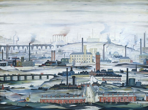
Industrial Landscape 1955 Tate © The Estate of L.S. Lowry

Industrial Landscape 1955 Tate © The Estate of L.S. Lowry

If you are an American coming over to London for your summer vacation this year, then I must recommend one exhibition to you: Lowry and the Painting of Modern Life at Tate Britain.

I was having a discussion recently about the painter L.S. Lowry and his impact on the art world. The discussion revolved around how Lowry is often a victim of the art world’s middle-class snobbery when assessed as a painter.

Be it panoramic or intimate vignettes of the North of England, Lowry’s matchstick men may look fairly idiotic; nonetheless they are instantly recognizable. Hard-edged, grotesque and comedic, Lowry’s painted people might look formulaic because they were drawn from his memory. Although simple-looking, you’ll recognize human variety in every one of his people. In fact, many faces in his paintings are former tenants. In his lifetime, Lowry made over 1,000 paintings and 8,000 drawings. If you asked him, “What are you doing when you’re not painting?” he might have replied, “thinking about painting.” Lowry often described himself as “a simple man,” but, in fact, he was a complex and contradictory character considering the murky realism of his environment and British history in general.

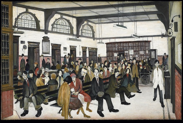
Ancoats Hospital Outpatients’ Hall 1952, Whitworth Art Gallery, University of Manchester

Ancoats Hospital Outpatients’ Hall 1952, Whitworth Art Gallery, University of Manchester

It took the attention of American art critic Jessica Stephens to wake the world up to Lowry’s work. In her writing in ‘The Studio’ in 1928, she describes how “beauty may be of many kinds…The work of Mr. L.S. Lowry has qualities which make it difficult to forget.”

For those not familiar with Lowry’s artwork, he was a modest man in both character and artistic temperament, known for his landscapes which spoke to the enormity of England’s industrialization. His pictures tell the story of life before the National Health Service (similar to Obamacare): pre small-scale Capitalism; pre strike meetings. In other words, British history in oil paint. Or, as Jessica Stephens wrote: “It is the nearest rendering of the life of Lancashire one knows.”

There are lots of assumptions surrounding Laurence Stephen Lowry (1887 – 1976). Here’s the truth for you; he was born to lower middle class parents (a real estate agent and hopeful concert pianist) in Stretford, Manchester, Northern England. A move to the industrial hamlet of Pendlebury led to an obsessive subject matter for the young painter. He captured the twisted forms the human body took when it was bent over machines for 12 hours a day, six days a week. Always scurrying along, the subjects of his paintings have very little time and money; too busy running around representing the rituals of public life from football matches (otherwise known as soccer to Americans) to protest marches, evictions and fist-fights. The experiences of the 20th-century working-class life in England were all captured by Lowry.

Coming-Out-of-School

Coming Out of School / Courtesy Tate © The Estate of L.S. Lowry

A rent collector by day and virgin by night, Lowry lived with his mother and was formally trained in drawing and painting under the French Impressionist painter Valette. The Parisian galleries and French art critics recognized and helped further his endeavors in the history of British art. He exhibited at the Lefevre gallery in Mayfair, London, and was a visiting tutor at the prestigious Slade School of Fine Art, recognised at the time as one of the best art schools in England.

What was unusual about Lowry was that he was not the typical moneyed student graduating from the Courtauld Institute of Art, nor was he an artist that fit into the traditional Eton-Oxford English mold. Nor did he study art history at St Andrews University in Scotland – where Kate Middleton and Prince William, now the Duke and Duchess of Cambridge, first met and studied art history. Why? Simply because Lowry’s subject as a painter was British industry – not the British Empire.

Although Lowry has never been a darling of the art world, his work does find its fans. The minute details in his densely-packed paintings give the eye much to feed on. More importantly, his landscapes of Northern England’s textile mills and factory chimneys make Lowry an artist of ‘place’. This ‘localism’ – topographies of slums in Manchester – speaks to those who inhabit these areas. Whereas traditionally labor is concealed within factory walls, Lowry brings it to the public’s attention: showing men at work or on the streets. Describing the slum subjects in his paintings, Lowry said: “I saw the industrial scene and I was affected by it. I tried to paint it all the time. I tried to paint the industrial scene as best I could. It wasn’t easy.” His ambition was to reveal the industrial scenes shaping England at the time. No one else had done it seriously and Lowry had an edge over the rest: he was wise about street life.

The Fever Van 1935 © The Estate of LS Lowry / Image courtesy of National Museums Liverpool

The Fever Van 1935 © The Estate of LS Lowry / Image courtesy of National Museums Liverpool

First melodramatic and pessimistic, his mood changes drastically after World War II. If you’re surprised at how small the paintings are, just wait for the last room in this exhibition, which houses the Industrial Landscapes. Here, for the first time ever, are five grand-scale panoramic paintings of Lowry’s world shown together. His world is a pictorial record of a time before Prime Minister Margaret Thatcher changed the face of British industry. However, when the industrial scene changed, so did the nature of Lowry’s subject matter. He couldn’t paint what wasn’t there. So Lowry left for the mining districts of South Wales, where he painted the trees looking like they oozed smoke. Faced with these panoramas the size of large-scale history paintings, the viewer finally understands the scale and scope of Lowry’s ambition.

Lowry certainly left more than a cultural legacy. What makes this the perfect exhibition at the moment, is our social awareness of our unemployment and current dismal financial times. Lest we forget, today, Lowry’s artwork often sells for millions of dollars. Enjoy.

Lowry and the Painting of Modern Life runs from 25 June – 20 October 2013 at Tate Britain.

By . Published in Cultural Weekly.

Global flight-path maps: Five interpretations

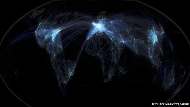
_67842750_michaelmarkieta_globalfligh

Michael Markieta’s images depicting flight paths across the planet attracted huge interest from our readers. What do the maps reveal? We asked five experts to give their interpretation.

The art critic

Estelle Lovatt, estellelovatt.com

Wow, it’s beautiful. It is not only dealing with two-dimensionality, it’s trying to create three dimensions, or four dimensions – giving you a notion that you are travelling across the surface of this image.

It’s almost like contemporary fractalisation – based on fractals, those beautiful divisions of science and nature. A number of artists have exploited them. Max Ernst based a lot of his surreal landscapes on fractalisation.

I would definitely exhibit these images. They give a great sense of movement and space. I think if Mark Rothko were alive today, he would be extremely inspired by this. Rothko’s half-grey and half-black paintings are sometimes thought of as purely abstract, but he was painting them at the time of the Moon landings.

One of the things artists have to do today is to keep up with contemporary visual imagery. They have to embrace modern technology, and an artwork does not just have to be oil on linen in a gilt, beautiful fixed frame. It has to be “of the time” – these are of the time and beautiful abstract shapes, very sensitively done.

The environmentalist

Bill Hemmings, aviation and shipping programme manager at Transportenvironment.org

When you see the three brightest patches – Europe, North America, and East Asia – you are seeing the three main focuses of aviation emissions. I am surprised that the Transatlantic flights do not show up as brighter because emissions are intense there as well.

The images re-affirm what we already know. Between 1974 and 2009, cumulatively, Europe was responsible for 38% of aviation traffic, Asia/Pacific was responsible for 29%, and North America for 20%.

In climate change talks, there is a lot of discussion about historical responsibility – the countries where the industrial revolution took place centuries ago bear the greatest responsibility. But in aviation it’s different. Long-haul flights, the source of most emissions, began in the 1970s, and we see that Asia is not that far behind. Not just China, but Thailand, Malaysia, Japan, Korea, and Australasia all carry a heavy responsibility.

You can see the three main areas of the world producing aviation emissions. They should take the lead in reducing them.

The aviation consultant

Europe’s hubs are bunched together – and send many flights to the Canary Islands

Europe looks so bright because it has so many short-haul flights. It’s also one of the busiest global markets and there are several hubs in relatively close proximity in Europe: Paris, Frankfurt, Amsterdam and London.

You can very clearly make out American hubs like Atlanta, Dallas, Houston and Denver – there’s a saying in the US that whether you go to heaven or hell, you have to go via Atlanta.

The map doesn’t quite reflect that the actual routes change from day to day, depending on variables like wind direction, air traffic control charges and fuel costs.

But you can see where things are changing. Asia is really dense with flight paths. In China you have a rising middle class travelling for business and leisure.

What we’re going to see in a few years is more connections between Asia and Africa, and South America and Africa, along with more “south-south” trade.

The data visualisation expert

Damien McCloud, geographic information systems, Arup

Visualisations like this are great. This is very clean and very simple and it gives an instant narrative. But my concern is that there’s a tendency to over-interpret these kinds of pictures. This is a snapshot.

You can see the density of the flights, but it doesn’t show you how many people are travelling on them. You could do that by colouring them differently.

Speaking as someone who got caught up in Hurricane Sandy last year, it would be good if you could overlay the map and show which flights are vulnerable to environmental risks.

The first thing you see is that there are three global hubs – the US, Europe and South-east Asia. If you were to overlay the major cities of the world it would show you most of them.

If you were coming from another planet and you were looking at this, you might think there weren’t many people living in Africa or Latin America.

The philosopher

Mark Vernon

It looks like a strange life-form, like seeing translucent plankton in the sea, lighting up in certain parts… and you wonder what’s going on in the darker parts, what kind of life, or activity, is concealed.

We are not seeing the life of individual human beings, but the life of the species as a whole, as if the species was one organism, pulsating like a jellyfish. Maybe it represents our collective existence?

Because of the darkness, it’s like a side of ourselves that no individual can control or understand. It feels like a dream – the collective unconscious perhaps.

In the images where the lights are denser, there is something a bit entangled and manic. It’s not completely peaceful. It’s beautiful, but when you start to look, it’s mad – a mad spider’s web, slightly psychotic.

Via: BBC