David Hockney Retrospective at The Tate Breaks Records | Video

WATCH VIDEO

It is the fastest-selling exhibition in the history of Britain’s Tate Gallery. Over 20,000 advance tickets have been sold for the David Hockney retrospective.

The artist is an innovator whose 60-year career has taken in sketching, painting, printmaking, photography and digital iPad experiments.

His depictions of sun-dappled Los Angeles swimming pools and wooded Yorkshire hills are among the best-known images in contemporary art.

“The exhibition, it has a focus, an emphasis, which is on the way throughout his mature career Hockney has really interrogated what it is to make pictures, why make pictures, how do you capture the real world of time and movement in something flat and static,” said Chris Stephens, curator of the exhibition.

The works in the exhibition begin in 1960 when the artist had just arrived at London’s Royal College of Art and takes in ’50’s abstraction.

From then on it develops and features Hockney through different periods which explore how you engage with the world, how you describe the world in pictures while also sparking a debate about what art is.

david_hockney

“He just uses the canvas. He uses color, he uses the camera, he uses film in the most exceptional and unimaginable ways and he has this great imagination and this great power to put on 2D what is actually 3D and he confuses us and he plays with us and he cajoles with us,” opined Estelle Lovatt, art critic.

The 79-year-old who once said, “art has to move you and design does not, unless it’s a good design for a bus” still paints.

He has always documented the places and people around him, his pictures act almost as a diary for his life. The artist described revisiting his works for the retrospective as like encountering old friends.

The exhibition runs to May 29 after which it will move to the Pompidou Centre in Paris from the end of June to October. It goes across the Atlantic to New York’s Metropolitan Museum of Art from November to February.


Source: Euro News | WATCH VIDEO

Advertisement

The cheek of it: 2016 Turner Prize shortlist revealed

stream_img

A giant golden sculpture of buttocks and more than £20,000 in pennies are among artworks in the running for this year’s Turner Prize.

An exhibition of the works by four shortlisted artists will go on display at the Tate Britain on Tuesday.

Video report by ITV News reporter Sally Lockwood, interviewing Estelle Lovat FRSA – Click to watch  video

estelle-lovatt-turner-prize-2016

  • Anthea Hamilton

Measuring around 16ft high, Hamilton’s Project For A Door (After Gaetano Pesce) is part of a series of “physical realisations” of images taken from the artist’s archive.

It also consists of a “brick suit” – a fabric suit which camouflages with the wall behind.

turner
A gallery assistant looks nominee Anthea Hamilton’s ‘Brick Suit’. Credit: PA
  • Michael Dean

Michael Dean’s work includes a piece consisting of £20,435.99 in pennies, to represent “one penny below the UK poverty line for a family of four”.

pennies
Thousands of pennies are used to deliver a poverty message. Credit: PA
  • Josephine Pryde

Josephine Pryde’s installation features a train model entitled The New Media Express in a Temporary Siding (Baby Wants To Ride) 2016.

train
Josephine Pryde’s train model. Credit: PA
  • Helen Marten

Helen Marten’s work features handmade as well as found objects such as cotton buds and fish skins to create “poetic visual puzzles”.

Turner Prize
Helen Marten’s installations features a various of objects Credit: PA

The winner of the contemporary art prize, which is now in its 32nd year, will be announced in December.

Source: ITV news

‘BLAH-BLAH-BLAH-BLAH!’ by Deborah Azzopardi

BLAH-BLAH-BLAH-BLAH by Deborah Azzopardi

As usual, Deborah Azzopardi‘s wholly original style mixes the trend of the traditional, with the contemporary, with a story.

An original retro rotary dial corded telephone from the 1970s is held by a woman.

Who is she?
She is you; she is me.

Who is she talking to?
Her mother, her lover, her friend, you, me.

Blah blah blah blah, we hear chatter that’s familiar; irrelevant, insincere, boring, time-consuming babble, proving life’s too short to jaw when there’s shopping to do and lovers to love!

More than a painting, it’s real life.

Rarely does Azzopardi sell a painting that has been published.  Anyone can have a print, not everyone ‘the’ original.  Why keep your money in the bank when it’ll look prettier on your wall.

McAlpine Miller: The New Collection

smc-taking-out-the-trash

It is so exciting to see McAlpine Miller’s latest artwork.

At first sight I wondered what it was, exactly, that McAlpine Miller’s newest artworks remind me of. Then it hit me. It’s the high-tech look. In them I see something of both the very modern and the nostalgic, in sync.

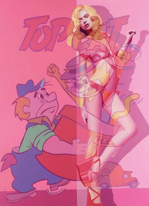
It is the merger of today’s science of technology with the prowess of ‘live’ cartoon action that is at the heart of his new body of artwork. And it is the clarity of these forms of his, both human and animated, that invite me ‘in’ to his frame, to be a participant. As if a play on the stage, his actors are framed in the scene through architectural elements that challenge today’s 3D space but, realising the art history of centuries past, it is as if you’re looking at a Roman Fresco that’s up to date with 3D Projection Mapping, but also stereographic 4D.

The similarities between his traditionally-painted canvases and today’s Social Media micro-electronics are what integrate his pictures. It’s as if waves of electrical quantum photons (light) take the place of both the traditional Old Master’s Classical or the Modernist’s Impressionistic prism, on level pegging. By taking the cartoons of yesterday and brightening them up with the cartoon colours of today, his sense of hue is as sophisticated as a Renaissance painter’s in softening natural looking skin tints that appear to be blended with today’s CGI pixelated palette. From traditional looking Antique White to Saddle Brown he pulls his visionary-art right bang-up-to-date through colours that are so …. of the ‘now’; of today.

Walk up any High Street, look in the fashion-chain store’s windows and you’ll see all the models dressed in the same lively, exotic, lush Pantone colours that McAlpine Miller squeezes from emerald green to chilli powder pepper red, canary yellow, tangerine tango, hot pink and peach puff. He uses colours that look as though they’re on a video display but they’re not, they’re on his canvas. Here is an artist who really understands what tomorrow’s Social Media is all about. His treatment of pictorial space is brilliant through the combination of multiple spaces and pictorial surfaces ‘released’ (painted) on ‘multiple platforms’ (picture planes) with an apparent Pixar style of animation about them. In eye-catching overlapping of graphics therein lays the McAlpine Miller Modernity.

All the things that David Hockney can do with an iPad in terms of colour, collaged composition and cut-and-paste layering, McAlpine Miller takes full circle by doing New School in an Old School style all, incredibly, with his oil paints! McAlpine Miller is taking Hockney a step further, by taking it a step backwards. Being far more complex, with traditional oil paints. His paintings have a 3D look about them. Seemingly composed through the employment of graphical cropped images edited under a CGI mouse-move, but it is all done with his sable paintbrush not the magic wand of Photoshop. With this, he paints pictures that connect with you, today. McAlpine Miller is one of the best artists of our time, painting about our time, in the best way I’ve seen. This is how he is changing the course of Art History – much in the same way that Da Vinci, Monet and Picasso did. The art of tomorrow starts here ….

Constantly looking around him at our everyday, McAlpine Miller has a set of references that are totally different to other painters. It’s as if, he says, that, “these realities combine to challenge us and perhaps create a greatly unstable world. By uncovering our real issues we discover ourselves. Undressed to the world, yet layered to the world. The illusion continues…”

It appears like he has tagged all this in Pixar animation, transforming, for example, the imagery of Stan Lee, founder of Marvel Comics, and Hanna-Barbera of the 50s and 60s, with Steve Jobs and George Lucas’s Pixar Animation Studios of today. As in, ’Taking the Trash Out’, where Hanna Barbera is alive in Hoagy’s Alley wearing this new summer season’s high wedge sandal. It is not just about taking the trash (rubbish) out, it is about the unwanted material – the waste – as the leftovers of our forgotten civilization, about to be recycled for posterity into today’s computer jargon of the ‘trash’ of the PC world. As he points out, by, “Taking the idea of the central figure and revealing an alternative opinion of that character, [this show hopes] to reveal the ongoing nature of the transparent life. Beauty is only ever skin-deep and our ability to hide behind the facade has become something of a 21st century art form.”

Something else, for (some of) the boys, highly topical and relevant to today, you cannot close your eyes to the psychological interpretation of reference to unconscious homosexual fantasy when Batman can now legally marry Robin. With Catwoman taking the part of the witness, ready to whip you in to shape, in, ‘Woman of the Night’. DC Comics’ Batman – aka Bruce Wayne the billionaire playboy, industrialist and philanthropist that all Americans aspire to become. Whilst for the girls, in, ‘Here to Save the Day’, Superman – the fictional Superhero inspires the a-typical personification of the American, apple-pie-loving girl-next-door Gibson Girl, to show what she is prepared to do for her country, not the other way around. McApline Miller explains, “Highly celebrated and widely identified, beauty hides the ugliness of our reality. War, hatred, anger and religion make up our every day.”

Where, even as goodness Captain America slaps the enemy in the face, you’ll see that it is an extremely sexy, McAlpine Miller high-heeled heroine, in, ‘Salute to the Captain’, from a time when comics cost a slim dime, and models today are just as thin. And in, ‘A Typical Feminine Trait’, he fuses the Terrytoons animation studio with the multiplex Uncle Sam (metaphor for the United States recruiting of soldiers for the Wars), fighting wars, fighting the great ideals of justice, and even, fighting the fusion of today’s fashionable franchise branding where the references to catwalk anorexia and financial waste (and gain), connect.

McAlpine Miller achieves all this through his all-action comic book colour palette painted with his idiosyncratic, painterly, Old Master skill. Together with the industrial precision of a commercial graphic illustrator, over, the prominence of what I’d say is surely his own, Social Media edit look. All blended with Chiaroscurism’s use of shade and light. Unique to McAlpine Miller, there are two kinds of light in his paintings. The light of day, where he makes everything known and available. And the internal, spiritual, light which is when he paints all that which we can only just about imagine in our dreams. I’d be happy to live in a McAlpine Miller picture.

To help you, he splits his multi-focus Cubist compositions in to single-viewpoints of flat, fixed, fragmented planes that sculpt his storyboard characters over overlapping perspectives. Exposing them as collaged Pop Art mass culture, that looks physically disturbed by an Expressionistic revelation of images, through to an Abstract subsistence of layer-upon-layer of veiled-on oil paint revealing, informing and identifying a connection that is pure lifestyle. This is all perfectly clear as McAlpine Miller’s wholesome flesh-and-blood bikini-babes retreat to an ever-eternal return that connects the past to the present, and even the future.

There is also something of the conservative, I’d say spiritual, in his compositions too. From the triptych, ‘Three Times a Lady’, surfaces the early Christian art formatting popular for church altar paintings from the Middle Ages. McAlpine Miller’s canvas is rich in a visual legacy enabling him to project his content-aware prominence, found only in today’s world of celebrity-worship icon advertising. Amidst all of this he uses highly distinctive, iconic, 1950s Americana which he blends with Romanticism. From the portrayal of the beautiful Movie Star from the Golden-olden-good-old-days-gone-by, off-of-the-Silver-Screen, to today’s multicoloured computer-animated, backlit fluorescent light of the iPad, it’s all pure cinema.

He is both painter and public entertainer that, if Jessica Rabbit were alive today, I’m sure that McAlpine Miller would be the artist whom she’d want to be framed by.

©Estelle Lovatt FRSA

The Industrial Allure of Lowry’s Urban Landscapes

Industrial Landscape 1955 Tate © The Estate of L.S. Lowry

Industrial Landscape 1955 Tate © The Estate of L.S. Lowry

If you are an American coming over to London for your summer vacation this year, then I must recommend one exhibition to you: Lowry and the Painting of Modern Life at Tate Britain.

I was having a discussion recently about the painter L.S. Lowry and his impact on the art world. The discussion revolved around how Lowry is often a victim of the art world’s middle-class snobbery when assessed as a painter.

Be it panoramic or intimate vignettes of the North of England, Lowry’s matchstick men may look fairly idiotic; nonetheless they are instantly recognizable. Hard-edged, grotesque and comedic, Lowry’s painted people might look formulaic because they were drawn from his memory. Although simple-looking, you’ll recognize human variety in every one of his people. In fact, many faces in his paintings are former tenants. In his lifetime, Lowry made over 1,000 paintings and 8,000 drawings. If you asked him, “What are you doing when you’re not painting?” he might have replied, “thinking about painting.” Lowry often described himself as “a simple man,” but, in fact, he was a complex and contradictory character considering the murky realism of his environment and British history in general.

Ancoats Hospital Outpatients’ Hall 1952, Whitworth Art Gallery, University of Manchester

Ancoats Hospital Outpatients’ Hall 1952, Whitworth Art Gallery, University of Manchester

It took the attention of American art critic Jessica Stephens to wake the world up to Lowry’s work. In her writing in ‘The Studio’ in 1928, she describes how “beauty may be of many kinds…The work of Mr. L.S. Lowry has qualities which make it difficult to forget.”

For those not familiar with Lowry’s artwork, he was a modest man in both character and artistic temperament, known for his landscapes which spoke to the enormity of England’s industrialization. His pictures tell the story of life before the National Health Service (similar to Obamacare): pre small-scale Capitalism; pre strike meetings. In other words, British history in oil paint. Or, as Jessica Stephens wrote: “It is the nearest rendering of the life of Lancashire one knows.”

There are lots of assumptions surrounding Laurence Stephen Lowry (1887 – 1976). Here’s the truth for you; he was born to lower middle class parents (a real estate agent and hopeful concert pianist) in Stretford, Manchester, Northern England. A move to the industrial hamlet of Pendlebury led to an obsessive subject matter for the young painter. He captured the twisted forms the human body took when it was bent over machines for 12 hours a day, six days a week. Always scurrying along, the subjects of his paintings have very little time and money; too busy running around representing the rituals of public life from football matches (otherwise known as soccer to Americans) to protest marches, evictions and fist-fights. The experiences of the 20th-century working-class life in England were all captured by Lowry.

Coming-Out-of-School

Coming Out of School / Courtesy Tate © The Estate of L.S. Lowry

A rent collector by day and virgin by night, Lowry lived with his mother and was formally trained in drawing and painting under the French Impressionist painter Valette. The Parisian galleries and French art critics recognized and helped further his endeavors in the history of British art. He exhibited at the Lefevre gallery in Mayfair, London, and was a visiting tutor at the prestigious Slade School of Fine Art, recognised at the time as one of the best art schools in England.

What was unusual about Lowry was that he was not the typical moneyed student graduating from the Courtauld Institute of Art, nor was he an artist that fit into the traditional Eton-Oxford English mold. Nor did he study art history at St Andrews University in Scotland – where Kate Middleton and Prince William, now the Duke and Duchess of Cambridge, first met and studied art history. Why? Simply because Lowry’s subject as a painter was British industry – not the British Empire.

Although Lowry has never been a darling of the art world, his work does find its fans. The minute details in his densely-packed paintings give the eye much to feed on. More importantly, his landscapes of Northern England’s textile mills and factory chimneys make Lowry an artist of ‘place’. This ‘localism’ – topographies of slums in Manchester – speaks to those who inhabit these areas. Whereas traditionally labor is concealed within factory walls, Lowry brings it to the public’s attention: showing men at work or on the streets. Describing the slum subjects in his paintings, Lowry said: “I saw the industrial scene and I was affected by it. I tried to paint it all the time. I tried to paint the industrial scene as best I could. It wasn’t easy.” His ambition was to reveal the industrial scenes shaping England at the time. No one else had done it seriously and Lowry had an edge over the rest: he was wise about street life.

The Fever Van 1935 © The Estate of LS Lowry / Image courtesy of National Museums Liverpool

The Fever Van 1935 © The Estate of LS Lowry / Image courtesy of National Museums Liverpool

First melodramatic and pessimistic, his mood changes drastically after World War II. If you’re surprised at how small the paintings are, just wait for the last room in this exhibition, which houses the Industrial Landscapes. Here, for the first time ever, are five grand-scale panoramic paintings of Lowry’s world shown together. His world is a pictorial record of a time before Prime Minister Margaret Thatcher changed the face of British industry. However, when the industrial scene changed, so did the nature of Lowry’s subject matter. He couldn’t paint what wasn’t there. So Lowry left for the mining districts of South Wales, where he painted the trees looking like they oozed smoke. Faced with these panoramas the size of large-scale history paintings, the viewer finally understands the scale and scope of Lowry’s ambition.

Lowry certainly left more than a cultural legacy. What makes this the perfect exhibition at the moment, is our social awareness of our unemployment and current dismal financial times. Lest we forget, today, Lowry’s artwork often sells for millions of dollars. Enjoy.

Lowry and the Painting of Modern Life runs from 25 June – 20 October 2013 at Tate Britain.

By . Published in Cultural Weekly.

Noa Lidor: Doubting Thomas

08noa

I believe that nothing happens totally by chance. And that to be a great art critic you have to believe in God – in order to understand that to be an artist is a God-given gift.

I feel it necessary to preface this essay by introducing myself as a Jewish art critic, who adores Leonardo da Vinci’s ‘The Last Supper’; its Apostles and their symbolic roles. That, in itself, is quite a feat for a ‘nice Jewish girl’. The part I find most irresistible is the spilt salt cellar near Judas Iscariot, who, abruptly taken aback, reacts to the sudden revelation of his plan to betray Jesus by tipping over the salt shaker which symbolises … ah, wait, back to all of that later..

For now, I want to tell you how I first became enticed by the artwork of Noa Lidor. In January 2011, I was reviewing an exhibition entitled, ‘Drawn from Life’, at the Abbot Hall Art Gallery, Kendal, Cumbria for BBC Radio 2’s flagship arts programme, ‘The Arts Show with Claudia Winkleman’.  I picked on Noa Lidor’s piece, mentioning how much I enjoyed it, for its symbolism, which I find quite irresistible.  I said that what I liked about Lidor’s artwork was her ability to use salt in a way that shaped channels of communication between localities and epochs as diverse and distinctive, unique and individual, as human characters that have narrated accounts that probe the ‘self’, as seen throughout art history. 

Being an art history lecturer, for me, to see how much they all overlap is particularly exciting.  It was through Lidor’s employment of salt – as a metaphor for tears, decay and aging, whilst simultaneously being a preservative over all that is life-quenching, and life-sustaining, that makes salt a most necessary natural element of the world.

Almost a year later, in December 2011, I visit her in her studio in north London, prior to the exhibition.  As much as she is plain-spoken, proud and intelligent, she is humble, gentle and down-to-earth. Her portfolio is sober and bold, united by an undercurrent of compassion for the human condition.  Not just a collection of ‘singles’, but an ‘album’.

I do like it when an ‘artwork’ comes together.  Be it the artist’s, or mine.  Let me explain.  I recently held a Leonardo da Vinci illustrated slide lecture and drawing from the model studio session at the Hampstead School of Art, London, following the National Gallery’s sell-out ‘Leonardo da Vinci:  Painter at the Court of Milan’ exhibition.  I focused on his symbolism, bringing the most Christian of art to some of the most orthodox and observant Jewish women in north London.  Ironically giving them the most religious of cathartic experiences. And so it happens that I find myself fascinated by Lidor’s work also because, as a Jew, I find the Judeo-Christian connections in her art so appealing.

In Chaim Potok’s book, ‘My Name is Asher Lev’, about a Hasidic Jewish boy living in New York City, the story follows Asher’s maturity as both an artist and a Jew, as he studies the paintings he becomes interested in – Crucifixions; as he explores the conflicting traditions of all that is traditional in art, versus religion.  For Asher, art is his religion, just as to me, it appears to be Noa Lidor’s. Besides which, I’ve always maintained that the artist’s studio is their temple. And I always feel that the Art Museum is a sort of temple for me, and when I visit it I feel like a pilgrim.

One further thing I want to tell you about is of my own sanctimonious practice before starting to write an art review.  I often imagine that I am describing the art to a blind person.

OBJ4154793_1--644x362

Lidor’s art is about the free-verse separation that unites poetry with prayer, using Duchampian ‘ready-mades’ that coalesce that which is public, with the personal, so that a ‘blind date’ takes on new meaning, offering much promise.

The installation ‘Field (Andromeda)’ is made of various brass bells deep-rooted, sunk into a double size bed mattress, in a way that exposes their inner, normally concealed, space. The bells, eighteen of them in four different sizes, are positioned to map out the star constellation of Andromeda – named after the princess who, in the legend from Greek mythology, was chained to a rock as a sacrificed to a sea monster. Perseus, the hero who slew the sea monster, saving the beautiful Andromeda from death at the last moment, later becomes her husband. Ah, I love a happy Hollywood ending.

 This is a very feminine piece, the bed’s symbolism of sleep and subconscious, as flatly laid-down and bare as Tracey Emin’s, ‘My Bed’, is a reflection of the self.  ‘This dark ceiling without a star’ (the title of the solo exhibition in which this piece was first shown) is the closing line of the poem ‘Child’ by Sylvia Plath.  Gazing somewhere in-between heaven and earth Plath shows how, distressed in spirit, she feels she is living a life without light [“this dark ceiling without a star”], ubiquitously stuck between the immense celestial and the small-time small-town, small woman that is herself (or in this case Lidor), quixotically domesticated.

The size of the bell-circles corresponds to the level of brightness of each of the stars. This, in turn, also perhaps looks like a rash developing over skin, or wounds in the surface.

Although silent, the significant positions and sizes of each bell may well be interpreted as tuneful notes on a musical staff that could form a muffled musical composition, gently silenced by the squeeze of padded mattress foam. Bells playing a ‘light’ (through the sense of meaning both ‘not dark’ and ‘not heavy’), albeit silent music, and ring loudly with the immensity of all that we love in big, grave sculpture.

‘Tank’ is a massive mural organized out of Pointillist dots, which, once joined by your eye Dot-to-Dot fashion, form the profile of a military tank. On near inspection you realise the tinny picture is created out of hundreds of thimbles implanted deep into a wall of plaster. Renaissance fresco-like, ‘Tank’, life-sized at 9 metres long, engages the wall as something that both separates and unites.

Think of the Western Wall (also known as Wailing Wall) – a remnant of the broken down temple in Jerusalem, where Jews come to pray, Or the Israeli West Bank security barrier, standing between the Israelis and the Palestinians, just as the walls of Babylon were fortification and the walls of Jericho fell after Joshua’s Israelite army marched around the city blowing trumpets. And Pink Floyd’s album, ‘The Wall’, which features the wall as part of ‘the problem’, realising an urge for destruction.
work-31-827x551
This exercise of ‘pointing’ – the thimble can be read as a surrogate for the fingertip – towards the reality outside the exhibition space, allows Lidor to ask the bigger questions we want answered about art. Making art. Making reality. Her pointing out that which might be on the other side of the wall – which we cannot see.

The use of thimbles in today’s BlackBerry and iPad technological age is somewhat out of date, maybe an anachronism yes, but they’re also romantic. Starry-eyed and prosaic; the stuff of fairytales bound up with moral myths of sacred narrative explaining how the world – and humankind – came into being; an abstraction wistful of times gone by, of the lost innocence of the child – suffer the little children to come unto me. It is of the simple, being above suspicion, as with the Chapman Brothers’ ‘Zygotic Acceleration, Biogenetic, De-Sublimated Libidinal Model’, where life – being both magnificent and transcendental, is numbed by God as something impossible.  In this way, Lidor is chief architect of the abstract assembly and parable, working with vessels and negatives. An intuitive artist, whose sagacity of knowing what it means to ‘feel right’ seems as if it originates from a compass she has within her bones, pointing in the right direction beyond ambiguity and beyond belief.

The thimbles, inserted bullet-like into the gallery wall, punctuated mark-making, become like a Leonardo da Vinci Cartoon – a full-size preparatory study. And of course, we know that da Vinci also, conceptually, invented the tank.

Lidor’s wall installation cleverly crosses the periphery of drawing into sculpture, somewhere in between the two and three dimensions. Drawing, as a 2D act, is unmistakably palpable, whilst the 3D upshot becomes mysteriously hard to pin down – so subtly intangible has Lidor made it, reduced in indication, as calculated and absorbed within the wall.  Whereas most artworks sit proud, out, on the wall, out to you, the gallery-goer, Lidor’s does the opposite; which is what I’ve come to expect of her now.  All an oxymoron.  This requisite tempts, invites, you to come closer within finger-reach of the work, enabling you to put your finger into it, to connect to it upfront and personal.  Feel the substance that Lidor’s image is ‘of’, like bullet holes, they punctuate space – like a full stop in the sentence of time – as Lidor’s work speaks of concerns of communication and all that is desire – both tactile and sexual.

The ability to touch and peer closely at this work heightens the obsessive, almost violent dimensions, of the process of means by which Lidor shoots hundreds of thimbles into the wall in this image, the manner of a tank: the metallic material-ness of which echoes the cold hard nose-metal circles of the thimbles, transforming the male fantasy of salvation into a female image bound to the wall surface, with nowhere to run.  No exit holes.  Simply a complex, yet subtle, sculptural disruption of space that maintains a still, pared down, feel of a highly sophisticated Renaissance drawn line in western art.

It is the union that Lidor draws between the two – the tank and the thimble – that establishes for me a rationality of discord and apprehension amid contrary parallels of control, proving that yes, opposites do indeed attract.  It’s the internal and exterior; big and little; masculine and feminine. Tank – a phallic, man-made erection symbolising man’s challenge to triumph over the force of machinery and tools (I cannot help but think of Epstein’s ‘Rock Drill’ being given a new life).  Whilst it is in the round, feminine, thimble that connubial intimacy is symbolised.  The private woman standing aside the public man, each with their ‘to protect-and-provide’ mind-set.

So whilst it is that ‘Tank’ talks about protection and security while denoting areas of danger and battle, it is the humble thimble’s purpose to protect and safeguard the small details that may be missed amid the coliseum of it all – the lady’s finger busy – ‘a stitch in time, saving nine’.  Being a Jewish mother (and Lidor is a Jewish mother too), for me Lidor’s images connect to the Jewish concept of ‘Eshet Chayil’ (Woman of Valour), who is full of life. Virtuous, able, maybe even a little lonely, within her domestic environment, as, self-absorbed and introvert, she tends to her ‘woman’s work’, consumed with a filling quixotic, reflective, worth of ‘home’.

The piece metaphorically invites you to poke a finger into the wall, to assert its solidity and question it at the same time. As in John

work-9a-827x551

20:24-29: “Now Thomas, one of the Twelve, called the Twin, was not with them when Jesus came.  So the other disciples told him, “We have seen the Lord.” But he said to them, “Unless I see in his hands the mark of the nails, and place my finger into the mark of the nails, and place my hand into his side, I will never believe.”  Eight days later, his disciples were inside again, and Thomas was with them. Although the doors were locked, Jesus came and stood among them and said, “Peace be with you.” Then he said to Thomas, “Put your finger here, and see my hands; and put out your hand, and place it in my side. Do not disbelieve, but believe.” Thomas answered him, “My Lord and my God!” Jesus said to him, “Have you believed because you have seen me? Blessed are those who have not seen and yet have believed.”

Lidor made a small graphite drawing in her sketchbook after Caravaggio’s ‘Doubting Thomas’ (not shown in this exhibition).  Caravaggio’s piece has been an influence upon Lidor in the way that Caravaggio depicts the scene with the finger in the wound; the way he chose to interpret the text of the scriptures – in which, by the way, it is never explicitly said that Thomas put his finger into Christ’s wound – only that he said he will not believe unless he does, and later that Jesus invites him to do it – all this, being relevant interplay for Lidor as a stepping stone from Bible to painting, making touching as equal as seeing.  Right down to the fact that we, the viewers, ‘see’ and ‘believe’ this scene as it comes through the painting. The power of it so strong, it brings both assurance of security and shock of horror.

Lidor’s new series of watercolours entitled ‘Doubting Thomas’, in shades of red, pink and brown, features imprints taken from a knitted round doily. She dips the doily into watery paint and rubs her hand over it to print it – blood-like – onto the paper. The result looks like an x-ray or like the imprint of hot metal on skin. Alongside these there are imprints of the artist’s forefinger. In the context of the title, the flower-like images of the doilies seem to represent wounds, pointed at or penetrated into by the finger.

Some flowers in Christianity symbolise wounds and suffering – such are the passion flower, named after the suffering of Christ and representing his five wounds, the poppy which stands for the blood of Christ and the red rose which symbolises martyrdom. The doily imprints in the ‘Doubting Thomas’ series also bring to mind ‘Rose windows’ – the symmetrical stained glass windows with a stylised flower-like shape – found in medieval churches.

Lidor is interested in the way that a natural element – the flower, is turned into a stylised pattern and becomes a decorative object – in this case the doily – by means of repetitive meticulous knitting labour (one might say futile, like masturbation). When she takes an imprint (a simple, quick action) from this object, it reappears on the paper as a general and abstract image of a flower again – as if the image of the flower is reclaimed, freed from the constraints of the decorative object.

After she started making them, some of these watercolours had also begun to remind her of images of sperm swimming towards an egg. I think of Munch’s ‘Madonna’.

In some of these drawings, the meanings expand, as a few of the ‘holes’ or rather the shapes created by the loops of the doily remain white and become like starts, pointed at by the finger. In a drawing that incorporates Van-Gogh’s ‘Starry Night’ Lidor traced all of the wavy brush strokes, leaving blank the stars and the tree – the tree like a finger or a phallus pointing towards the stars. In another drawing, the doily is halved, creating a metaphor of a hand-held fan which reminds me of Goya’s ‘Black Series’, his tapestry cartoons and his paintings of Spanish women waving fans.  Although a highly feminine art, fans were also used as weapons.  In Goya’s court of Spain, the fan was used in a more-or-less hush-hush unsaid cryptogram of communiqué.

In ‘And indeed there will be time’ (the title an excerpt from TS Elliot’s ‘The Love Song of J. Alfred Prufrock’), Lidor stacks about two hundred hand knitted cotton doilies under a small wooden side table. A hole in the tabletop, cut out in the shape and size of the doily, reveals the top doily in the stack, which is level with the tabletop, as if it lies upon it.

A knitted doily on a side table is very middle-class, bourgeoisie. It speaks of the woman at home. In this installation it seems as if, like in a Magritte painting, the doily has suddenly bitten through the tabletop like acid and has multiplied – like a mutated cell, like cancer. Penetrating the surface of the table right down to the floor; even through the floor to the centre of the earth, like a meteorite piercing the clay soil of life’s cycle, taking root in its sobriety and offering stability in its ground(ing). The radial symmetry of the doilies appears to fall through the table towards the ground with as much energy as Michelangelo’s God breathing the spark of life through the Earth’s atmosphere into Adam (Sistine ceiling), when Adam’s finger and God’s finger are about to … touch. Like Leonardo’s knot pattern engraving, or an Indian Dream Catcher, so beautiful, the doilies are suggestive in shape of a snowflake too – white in colour (spiritual and pure) that changes into something ‘clear’ once melted, almost as if it is traded for water – as it becomes see-through and unseen, like a ghost.
Lidor’s works make me think of a matriarch coming to repair and fix, as in Vermeer’s ‘The Lacemaker’, and the way Louise Bourgeois sews up her past. At the same time, she is questioning the flat surface, searching for depth and meaning. It is in this same way that you’ll look at Caravaggio’s ‘Doubting Thomas’, you too assuming the Doubting Thomas refusal to believe in something without direct, physical or personal evidence of it. You, the sceptic, invited by Lidor to ‘believe’.  It is in this approach that Lidor uses her basic household items. Establishing their ordinariness and familiarity. Yours for the discovery.

Lidor explores space that is disrupted through sculpture, which is inspired by the realities of (her) life. For the installation titled ‘I have heard the mermaids singing’, several lines from TS Elliot’s ‘The Love Song of J. Alfred Prufrock’ were transcribed into Braille, blown up and recreated with small hills of table salt. The text becomes unreadable to the seeing eye as it is to the unseeing touch. Standing up by the force of gravity alone, à la Anish Kapoor, the salt mounds are arranged like mini sculptures on top of a family-sized wooden dining table, that seats the perfect family, of four, in order to take on a cultural dimension – like Joseph Beuys’, ‘How to Explain Pictures to a Dead Hare’.

Lidor has created a few series of drawings onto pages from a Braille book. In the series ‘Getting on with Gardening’ (2004-5), she imprinted parts of her fingers and palms onto the pages, creating floral images. The Doily series (2011) is done with black marker pen. Her current series includes images such as a tank, a bell tower and a lighthouse, all created in a (literally) Pointillist manner by repeatedly imprinting the tip of her finger onto the Braille page.
dfl4

Back to the use of salt that I started talking about at the beginning of this essay.  Salt, as a symbol for enlightenment from the Old Testament to the New.

To ‘betray the salt’ is to betray the Master.  Judas Iscariot knocks over the salt to symbolise the final days of Jesus, as told in the Gospel of John (13:21), when Jesus announces that one of his Twelve Apostles would betray him, rubbing salt in the wound in the absence of both instruction and obstruction.

The salting of the condemned indicates the severity of punishment too.  St. Mark (9:50) reads, “Have salt in yourselves, and be at peace with one another.”  The salt here, referring to the goodwill that ‘seasons’ relationships, friendships and the compassionate intelligent considerations between people.

It’s of preservation; brine water – a necessity of life.  A mineral used since ancient times in many cultures as a seasoning, preservative, disinfectant, ceremonial offering, unit of exchange.  Metaphorically it signifies permanence, loyalty, durability, fidelity, usefulness, value and purification.

I’m interested in how Lidor uses Braille to expose the limitations of her media and to explore the anomalies of life and human experiences, in a way that suggests a failure to contain these experiences. One of the means by which Lidor gives this expression is through the (im)possibility of actual finger contact by you; the drawings are behind glass, and any attempt to touch the mounds of salt would mean catastrophic failure since they’d inevitably disintegrate and disrupt the work’s ability to bear any sort of symbolic meaning.
Salt is also all that’s left as the residual remains after a dead body has decayed and the tears of the mourners have evaporated. In Genesis (19:26) an angel led Lot out of Sodom before destroying the city, and turned his wife into a pillar of salt for looking back whilst fleeing.  The punishment for nostalgia is ossification.  As a history that interacts with the present, let Lidor’s artworks serve as a warning to you, to be on your guard; to be in the world, but not of the world.
Like a diamond, salt is, in itself, indestructible.  From the most expensive material to the cheapest, when salt looses its taste it can be interpreted as being in a world filled with sin and deceit where one becomes contaminated and thus unsuccessful at being an effective ‘disciple’.  This – being the spiritual essence of life as in the New Testament, in the Sermon on the Mount passage, referencing salt, as in Matthew’s account (5:13) that refers to his disciples as “the salt of the earth.”  And as Leviticus (2:13) reads, “And every offering of your grain offering you shall season with salt; you shall not allow the salt of the covenant of your God to be lacking from your grain offering. With all your offerings you shall offer salt.”

Exploring the space between reality and our memory, Lidor’s work appears misleading; being minimal and sparse, but actually, it is the opposite.  So ‘heavy’, that only a tank, or a woman, could cope with the emotional load.

The fact that you cannot touch it forces you to use other senses. Like Doubting Thomas pointing a finger into the wounds of Christ, while trying to point out the reality behind everything. It is our inability to touch or hear Lidor’s artwork that brings about the true believers in all of us, just as it is Thomas’s inability to touch the risen Christ’s chest cavity that gives rise to his need to substitute ‘touch’ with ‘faith’. Lidor’s art is accessible through its inaccessibility.

©Estelle Lovatt FRSA